| Image |
Comment |
| 08/17/2005 12:02:06 PM |
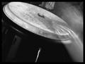
Drum Circleby JaimesonComment: If only the drum was in focus. I like the blurred hands. Background above the drum needs to be plain and uncluttered. Not quite clear enough. |
 Photographer found comment helpful. Photographer found comment helpful. |
| 08/17/2005 12:00:53 PM |
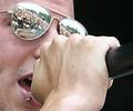
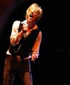
Living A Dreamby AtlantaRockSceneComment: Superb idea, I love the reflection. I think it's too closely cropped though, at least include the end of the microphone. More dof needed, one of the main focal points is the pierced lip which needs to be in focus. 2x3 ratio would have worked much better here. |
| 08/17/2005 11:59:11 AM |
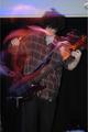
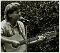
Moonlight Serenadeby DanielCzajaComment: Lovely idea, but the romantic intentions are spoilt by the harsh light. Converting to b&w could have been very effective. I like the composition. |
| 08/17/2005 11:57:58 AM |
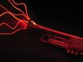
Sultry and Smokin'by dahvedComment: Interesting effect, but certainly doesn't say 'live music' to me. Trumpet needs a little more light. |
| Photographer found comment helpful. |
| 08/17/2005 11:57:08 AM |
Jackman slapby PynchyComment: Interesting effect, spoilt by the line in the background which bisects his head. I'd also have gone in much tighter, why do you need his legs? Composition seems unimaginative. What's that at the bottom right of the shot, couldn't it be cropped out? |
| 08/17/2005 11:55:27 AM |
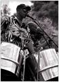
Caribbean Steel Bandby KonadorComment: Seeing as he's at the microphone, I'd have grabbed him with his mouth open and waited for them to get a bit more into it, they look a bit static here which is not what this kind of music is about. I'd also have tried to get a bit lower so the microphone was less close to the eyes of the performer at the back. |
| Photographer found comment helpful. |
| 08/17/2005 11:53:52 AM |
The Preacher and his Guitarby chik0325Comment: Background is a tad too cluttered, I'd have reduced the dof by backing away and increasing the zoom, or opening the aperture. His expression doesn't really do a lot for me here. Elbow is cropped just a tad too much for my taste. Not really a fan of the green tones. |
| 08/17/2005 11:50:56 AM |
blindsideby singeComment: Not sharp enough, and the composition just doesn't do a lot for me. I would have zoomed closer, leaving plenty of negative space to the left (as he's looking that way). A little overexposed. |
| Photographer found comment helpful. |
| 08/17/2005 11:48:56 AM |
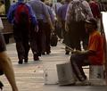
Rhythm of the Cityby milo655321Comment: Seems a little underexposed... at least raise the gamma. His sticks don't look like they're moving... how about a tripod and some motion blur with the performer staying still (apart from his hands) while the commuters pass by? |
| Photographer found comment helpful. |
| 08/17/2005 11:47:35 AM |
Buskerby burtctComment: Not keen on his expression and damaged finger. Needs more of a sense of context and surroundings IMO. |
| Photographer found comment helpful. |
Home -
Challenges -
Community -
League -
Photos -
Cameras -
Lenses -
Learn -
Help -
Terms of Use -
Privacy -
Top ^
DPChallenge, and website content and design, Copyright © 2001-2026 Challenging Technologies, LLC.
All digital photo copyrights belong to the photographers and may not be used without permission.
Current Server Time: 07/25/2026 08:53:40 AM EDT.