| Image |
Comment |
| 08/17/2005 04:06:15 PM |
Mullockby mpembertonComment: Shadows cast by the guitar necks shows bad use of lighting. Heads in the foreground totally spoil the shot, especially by obscuring the guitarist's hand. Composition doesn't feel balanced. Background hasn't been thought about, the guitar on the wall doesn't complement the shot. |
 Photographer found comment helpful. Photographer found comment helpful. |
| 08/17/2005 04:04:05 PM |
the musiciansby chusterComment: Oh, it's so sad when I see a whole instrument... except for one tiny part of it that's been accidentally cropped off. A different focal length would have avoided the distortion you've got here from using wide angle. Otherwise the background lines would be straight. I feel it's accidental that the tuba player's face is obscured by his instrument. Composition doesn't seem thought out... placing the musicians using rule of thirds would have helped. If you have writing in the background, make sure that the whole words are visible. One of your subjects breaks up the words here which does not look deliberate. |
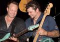
| 08/17/2005 04:00:46 PM |
soul musicby guillamirandaComment: An interesting experiment, but I don't think it's quite worked here. The headstock is overexposed and nothing is in focus. The background is too cluttered and distracting. I don't get a feeling of live music going on... there's not enough context. |
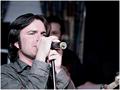
| 08/17/2005 03:59:40 PM |
Lead Singerby FirstyComment: Slightly overexposed, but what spoils this shot is the musician in the background. Everything in the background should be part of the composition of any photo... the background musician clearly hasn't been placed well in the shot so this looks like a snapshot. The lead singer's face is too obscured by the mic, you really need to be more to the side. |
| Photographer found comment helpful. |
| 08/17/2005 03:57:12 PM |
Gavin Degraw - Front Rowby WestmoComment: That's terrible jpeg artifacting all over the shot, or is it caused by a combination of high compression and NeatImage? Not particularly imaginative composition, and I feel his face is too near the top edge of the frame. I've never heard of him, but I hope you enjoyed this comical looking guy. |
| Photographer found comment helpful. |
| 08/17/2005 03:54:14 PM |
|
| 08/17/2005 03:53:51 PM |
Saturated Drummerby Hes2ThinComment: What a great backdrop behind the drummer! Nice light, although this shot is sadly overexposed so we miss a lot of the effect of being bathed in light. Nothing seems particularly in focus, and I think the placement of the drummer in the shot doesn't work compositionally. |
| Photographer found comment helpful. |
| 08/17/2005 03:52:21 PM |
Sunday Afternoon in the Parkby pixelyComment: This snapshot is way too cluttered, there's no clear place for the eyes to rest, the trees especially are too distracting. Perhaps getting in close to the dancing couple with the musicians in the background could have made a better picture? |
| 08/17/2005 03:50:37 PM |
|
| 08/17/2005 03:50:15 PM |
Bluesby hitendraComment: Looks too NeatImaged/blurred to me. Either more or less blue sky would have worked better for me. Here, his eyes are almost in the centre of the shot which seems a bit unimaginative. |
| Photographer found comment helpful. |
Home -
Challenges -
Community -
League -
Photos -
Cameras -
Lenses -
Learn -
Help -
Terms of Use -
Privacy -
Top ^
DPChallenge, and website content and design, Copyright © 2001-2026 Challenging Technologies, LLC.
All digital photo copyrights belong to the photographers and may not be used without permission.
Current Server Time: 07/24/2026 08:29:02 PM EDT.