| Image |
Comment |
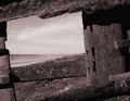
| 02/25/2006 05:22:34 AM |
A window to marsby armandusComment: Not clear enough to have real impact, it took me a while to work out that it was some kind of beam below the shoreline. Sky is nowhere near interesting enough. The textures captured here seem like an afterthought, rather than the reason why you took the photo. Nothing seems in focus. |
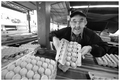
| 02/25/2006 05:20:33 AM |
Harry The Egg Manby hotpastaComment: Could do with darker shadow tones, but a nice documentary portrait. I'd have made more of the eggs in the foreground and avoided the overexposed background to the left by repositioning myself. Shame it's not sharper. |
 Photographer found comment helpful. Photographer found comment helpful. |
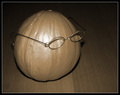
| 02/25/2006 05:18:36 AM |
Melon with an attitudeby marvinComment: Humourous snapshot for the family, not a very well carried out shot in a photo challenge.
Onboard flash and high ISO hasn't worked well here. Composition isn't bad though, at least it's not dead centre. |
| Photographer found comment helpful. |
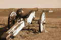
| 02/25/2006 05:16:13 AM |
Port of Portland, 1861by bmoraComment: A snapshot of a cannon. Why?
Horizon doesn't seem to have been thought about. Why make it exactly level with the barrel of the cannon? This confuses what is presumably supposed to be the focal point of the photo.
Bad light, there are shadows on the cannon which takes away from the composition, and there is too much bright light on the wood.
It doesn't feel balanced compositionally. Although you've placed the cannon right up to the bottom-left corner which creates a nice leading line, the space to the right of the cannon feels odd. It might have worked better with more space to the right of the cannon.
No detail in the sky.
Nothing seems to be using rule of thirds.
It's a photo of a cannon... unless I was a cannon geek, why should this interest me?
Sepia tones don't do much for me with this image, and it seems a bit low on contrast. |
| 02/25/2006 05:10:01 AM |
Black & Greenby HafiComment: Love this, a great take on the challenge. Shame about the basic editing rules, the specks on the edges ruin the effect. |
| 02/25/2006 05:09:07 AM |
|
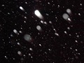
| 02/25/2006 05:08:04 AM |
Snow or Stars?by SomethingNewComment: I've seen this too many times on photos that have gone wrong with onboard flash and rain/snow. It doesn't look deliberate enough IMO to be arty. It needs better composition. |
| 02/25/2006 05:06:43 AM |
I am protectedby greslizzzComment: An interesting take on this common viewpoint, but the composition is a little too chaotic for my taste. |
| Photographer found comment helpful. |
| 02/25/2006 05:06:01 AM |
Autumn Dreamingby havy2008Comment: Nice feel to this photo, but the composition feels awkward. The blob to the left of the leaf puts me off. |
| Photographer found comment helpful. |
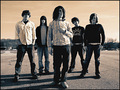
| 02/25/2006 05:05:07 AM |
Middlecoast - the bandby Drummerjd356Comment: Another band pic, looking like many other band pics. I like the frontman... maybe more could have been made of his forlorn/wistful expression, although his hips have been posed awkwardly. Everyone else looks quite stiff/bored. Not sure I like the brown/orange sky. My main criticism is that this photo tells me nothing about the band, it's quite bland. |
| Photographer found comment helpful. |
Home -
Challenges -
Community -
League -
Photos -
Cameras -
Lenses -
Learn -
Help -
Terms of Use -
Privacy -
Top ^
DPChallenge, and website content and design, Copyright © 2001-2026 Challenging Technologies, LLC.
All digital photo copyrights belong to the photographers and may not be used without permission.
Current Server Time: 07/24/2026 02:09:54 AM EDT.