| Image |
Comment |
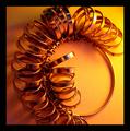
| 07/16/2003 07:48:07 AM |
Ringsby OceanpieComment: Took a very long look at this one to see what doesn\'t quite sit right with me. At first glance, it looks great, and LOTS of round. However, I don\'t think there\'s enough sharpness, and it looks like there\'s a yellow cast to the image (I know the backround is yellow!! But the highlights on the rings look too yellow). I\'m not crazy about the composition, and feel you could have been more creative with the shadows. 7
|
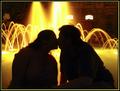
| 07/16/2003 07:26:58 AM |
Midnight Romanceby SatelliteSpeckComment: Ooops... didn't realise the models would be reading this!
I think it could have looked better if you two were holding hands or a little closer, it's the way that your torsos are turned away from each other a little that spoils it for me.
Anyway, my best to the both of you! |
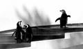
| 07/15/2003 09:59:54 PM |
I Winby jillzComment: Such great character! The normally horrible 'concreteness' of London Zoo has really added to this composition! |
 Photographer found comment helpful. Photographer found comment helpful. |
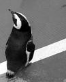
| 07/15/2003 09:58:35 PM |
Lonelyby jillzComment: Very nice, wonderful textures on the fur, I love the way that his gaze lines up with the grid pattern. Perfectly exposed. |
| Photographer found comment helpful. |
| 07/14/2003 01:08:34 PM |
Hot-N-Freshby wayne9232Comment: Greasy food seldom looks good in photographs, I'm afraid this one is no exception. I know this SHOULD convey a sense of heat, but it just doesn't do it for me. The composition isn't quite right... it just doesn't seem balanced. The ratio of frying pan to table, and the ridge in the table, and the amount of spatula that's showing, and the cheese... it doesn't work for me. It looks also like not much thought went into the lighting which is too harsh. There's too much glare in the egg yolks, and the shadow in the frying pan looks accidental. 4 |
| 07/14/2003 01:02:23 PM |
Green in Front - a Meditationby Starbright1973Comment: I don't understand how this conveys temperature... are these candles? If so, they're hard to make out. The picture is far too small. Interesting effect from using extreme wide-angle, the glare is pretty bad though from the reflections of the light source. 3 |
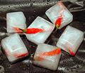
| 07/14/2003 08:36:11 AM |
Chilli?by robsmithComment: Oh yeah, what a great idea! I don't like the lighting though, which looks like it was a bit harsh. The shadows indicate that there was one light source which wasn't diffused. I think you could have made more of the reflective qualities of the surface that the ice is on... I don't think enough thought went into the composition of the ice cubes. The empty space at the top left especially doesn't work for me. The water droplets are very effective however. 6 |
| Photographer found comment helpful. |
| 07/14/2003 08:32:50 AM |
Hot! Hot! Hot!by Alpine99Comment: Great idea... shame that your chillies weren't anti-aliased, the pixelated look really detracts here. The composition is a bit too centred for my taste... 3 symmetrical chillies and a diagonal across the centre make this crop a bit unimaginative for me. 6 |
| Photographer found comment helpful. |
| 07/14/2003 08:30:30 AM |
Soaking in the Raysby shareinncComment: Aren't these creatures from the Arctic Circle? That's why this doesn't convey warmth to me. It just makes me confused! I wish you'd captured his/ her face, as it is, the eye isn't sure what to focus on. I find it settles on the wrinkles, which I don't think should be the focal point. The patterns of colours in the background look haphazard, and don't add to the composition. The shadow looks a little harsh as a result of shooting in the midday sun. 5 |
| 07/14/2003 08:26:40 AM |
Blazing Sunsetby sunflowerComment: Nice colours, but there's too much JPEG artifacting, especially around the sun. The noise is very distracting as well. The sun is too in the centre for the composition to be effective, and I can't help wishing for something else in the picture to add interest. 4 |
Home -
Challenges -
Community -
League -
Photos -
Cameras -
Lenses -
Learn -
Help -
Terms of Use -
Privacy -
Top ^
DPChallenge, and website content and design, Copyright © 2001-2026 Challenging Technologies, LLC.
All digital photo copyrights belong to the photographers and may not be used without permission.
Current Server Time: 07/23/2026 02:54:48 AM EDT.