| Image |
Comment |
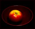
| 07/16/2003 10:19:22 AM |
Still Roundby ToddhComment: Beautiful colours, shame about the glare which really detracts. The composition seems a bit off... I'd have prefered more bold placing of the bowl within the crop, ie centre, corner, one of the 3rds, etc. 6 |
| 07/16/2003 10:17:43 AM |
domeby magnetic9999Comment: Shame about the building at the bottom left. Great clouds in the background. The placement of the flag looks accidental rather than deliberate, and is not helped by the poor light in the foreground of the building. Nice architectural shot though. 7 |
 Photographer found comment helpful. Photographer found comment helpful. |
| 07/16/2003 10:15:26 AM |
Eyesoresby LilCasualGurlComment: Very entertaining, shame about the harsh shadow from the lady on the right.Great character shot. 8 |
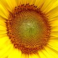
| 07/16/2003 10:13:29 AM |
Sunflowerby valasaurusComment: Hmm, I've seen this picture a lot of times, usually a lot sharper! Next time try extending the dof, make sure there's no wind and use a tripod. Try to find a fresh angle on it as well! 6 |
| 07/16/2003 10:12:09 AM |
Edggyby FayechComment: The egg is too centred for my taste, other than that a very nice shot. Interesting textures and lighting. I really don't like those borders though. 7 |
| Photographer found comment helpful. |
| 07/16/2003 10:11:12 AM |
Glimmeringby coccusComment: Yes, very similar to mine which seems to be dying! Bloomin' DPC. Anyway, interesting lighting, contact lenses do indeed have roundness. Nice colours on your background. Interesting angle... but too centred for my taste. Shame about the noise levels. 7 |
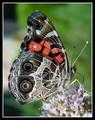
| 07/16/2003 10:09:02 AM |
I Have Round Spots On My Wingsby GallatinComment: That may be, but I don't think it's entering the spirit of the challenge which was to explore roundness, not take photos of things which happen to have some small round things on them. Nice photo though! 5 |
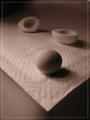
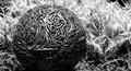
| 07/16/2003 09:50:03 AM |
Growing Sphere of Influenceby adineComment: What the heck is that?! Interesting object, shame the background is overexposed. Black and white is probably not the best option for this photo, as it cuts down the contrast between the ball and the background. 7 |
| Photographer found comment helpful. |
| 07/16/2003 09:46:59 AM |
Hauling Saltby GraciousComment: Some people have too much time on their hands! Lol. Shame about the levels of noise, nice colour for your background though. Lighting is a bit harsh. 6 |
| Photographer found comment helpful. |
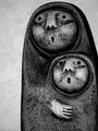
| 07/16/2003 09:44:29 AM |
Ooooooh !!!by bmarquezComment: What a great title... reminds me of Monty Python!
Nice lighting at the front of the subject, shame about the shadow. Perhaps 2 light sources would have helped here. A little uncomfortable with existing artwork here. 7 |
| Photographer found comment helpful. |
Home -
Challenges -
Community -
League -
Photos -
Cameras -
Lenses -
Learn -
Help -
Terms of Use -
Privacy -
Top ^
DPChallenge, and website content and design, Copyright © 2001-2026 Challenging Technologies, LLC.
All digital photo copyrights belong to the photographers and may not be used without permission.
Current Server Time: 07/23/2026 12:33:08 AM EDT.