| Image |
Comment |
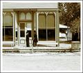
| 08/04/2003 09:40:08 AM |
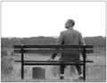
The Shootistby moodvilleComment: Great vintage feel to this photo, I like the level of contrast. I think it could have benefited from some sharpening though. 7 |
 Photographer found comment helpful. Photographer found comment helpful. |
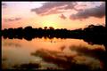
| 08/04/2003 09:39:09 AM |
1998 The Summer of the Swans,James Clarkby pitsamanComment: Lovely shot, beautiful colours. I feel this could have done better without the swans being placed in the centre, and without the horizon cutting across the middle here. Symmetry like that is rarely effective. Swans are a little small, did they come closer? 7 |
| Photographer found comment helpful. |
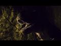
| 08/04/2003 09:37:38 AM |
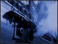
Jurassic Parkby jenaromComment: Nicely lit, good dof, interesting composition. However, I think you either needed more detail in the rest of the shot other than the teeth, or less detail. As it is, it doesn't look deliberate enough. I think you could have done with a little less negative space to the left... or right, either would have done! 7 |
| Photographer found comment helpful. |
| 08/04/2003 09:34:50 AM |
|
| Photographer found comment helpful. |
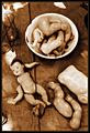
| 08/04/2003 09:33:50 AM |
Forrest Gump by PedroComment: Nice shot, well composed. Tones are a little on the light side for my taste. Could do with a little sharpening. 8 |
| Photographer found comment helpful. |
| 08/04/2003 09:32:55 AM |
|
| Photographer found comment helpful. |
| 08/04/2003 05:42:23 AM |
The Dentist by grigrigirlComment: Absolutely superb! My favourite this challenge. The victim's expression is amazing... I didn't know a mouth could open that wide! Excellently executed, the lighting is spot on. The graininess works well. Great composition. 10 |
| Photographer found comment helpful. |
| 08/04/2003 05:40:30 AM |
Psycho by JackoComment: The best of the 'Psycho' shots in this challenge by a mile! Great lighting, nice sharp silhouette, interesting composition. 10 |
| Photographer found comment helpful. |
| 08/01/2003 07:36:57 PM |
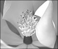
Magnoliaby DennisFComment: We have a winner! My favourite, and only 10 this challenge. Wonderful composition, nice range of light tones. Just the right amount of blur. |
| Photographer found comment helpful. |
| 08/01/2003 12:43:28 PM |
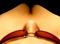
Full Figuredby ImagineerComment: Not very flattering... mainly down to the yellow colour cast. The glasses and nose are either not blurred enough, or not clear enough... either way, it needs to look more deliberate. Other than that, humourous picture, very cheeky! The black in the top corners works well. 6 |
| Photographer found comment helpful. |
Home -
Challenges -
Community -
League -
Photos -
Cameras -
Lenses -
Learn -
Help -
Terms of Use -
Privacy -
Top ^
DPChallenge, and website content and design, Copyright © 2001-2026 Challenging Technologies, LLC.
All digital photo copyrights belong to the photographers and may not be used without permission.
Current Server Time: 07/23/2026 08:21:25 AM EDT.