| Image |
Comment |
| 09/02/2003 12:33:46 PM |
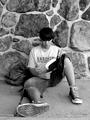
Back to Schoolby mgkarimiComment: Almost brilliant, I really like this shot, which pulls you in to try to find out what is going on. Great colours in the background, but the composition is just a bit cluttered. The exposure is just a bit too dark for me. Your subjects have great expressions, chemistry and attitude. 7 |
 Photographer found comment helpful. Photographer found comment helpful. |
| 09/02/2003 12:31:01 PM |
Quiet Moment Between Classes.by SonifoComment: Interesting portrait, the foot in the foreground is a nice touch. Interesting background, but could perhaps do with more contrast with subject. Composition a bit too centred for my taste. 7 |
| Photographer found comment helpful. |
| 09/02/2003 12:29:26 PM |
Where have all the children gone?by tomlewis1980Comment: Nice idea, the selective desat works well here. To me, the desaturation says that the playground is grey and without colour because the children have gone, while the red and blue are like traces of the children still left in memory. Shame about the burnt out sky though, and the composition doesn't quite do it for me. 7 |
| Photographer found comment helpful. |
| 09/02/2003 12:27:37 PM |
Back to Schoolby hortopthComment: My favourite shot this challenge. Great use of motion blur. Nice range of tones, looks great in b&w. I like his expression. Effective cropping and composition. I would have prefered a shutter speed just a tad faster though, so the face would be sharper while leaving the hand blurred. 8 |
| 08/28/2003 07:56:34 AM |
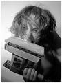
Working on Heavy Metalby gstrotmannComment: Nice idea, but the composition really doesn't do it for me. A few tips: I think the guitar neck should point up at an angle. There should be less manuscript, and the direction of the lines should be an integral part of the composition. Experiment with more dramatic lighting, this picture doesn't set a mood to me. For example, for heavy metal I'd experiment with red lighting that would throw a lot of shadows. 6 |
| Photographer found comment helpful. |
| 08/28/2003 07:52:44 AM |
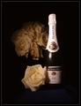
Tools of Seductionby TurbotechComment: Very nice idea, but shame about the glare on the bottle, and I'd have liked it a lot sharper, especially the writting on the bottle. Other than that, great lighting. Love the way everything blends into the background. 7 |
| Photographer found comment helpful. |
| 08/28/2003 07:51:19 AM |
|
| Photographer found comment helpful. |
| 08/28/2003 07:50:14 AM |
Pressureby thelselComment: Great shot, nice tectures and lighting. Score: 7, to score higher I'd have to understand only by looking at the photo why someone would be cracking an egg in a vice! Have I missed a subtext?! |
| Photographer found comment helpful. |
| 08/28/2003 07:48:25 AM |
haha! you'll knock me down?by AesculapiusComment: Funny, nicely lit, good dof, I like the saturation. Shame about the 2 glare spots. Great background. A bit too whimsical to get a REALLY good mark from me though... 7 |
| Photographer found comment helpful. |
| 08/28/2003 07:45:24 AM |
Love and a Dictionary: Tools of Communicationby alyriveroComment: Interesting concept, but doesn't make for a good photograph IMO. Compositionally there is nothing here that exites my imagination. The shot you've gone for which is straight from above doesn't work because the the words aren't straight. Shame you can see the words on the other side of the page. The fading text is not attractive. 3 |
Home -
Challenges -
Community -
League -
Photos -
Cameras -
Lenses -
Learn -
Help -
Terms of Use -
Privacy -
Top ^
DPChallenge, and website content and design, Copyright © 2001-2026 Challenging Technologies, LLC.
All digital photo copyrights belong to the photographers and may not be used without permission.
Current Server Time: 07/24/2026 04:59:17 AM EDT.