| Image |
Comment |
| 09/07/2003 06:48:54 PM |
|
 Photographer found comment helpful. Photographer found comment helpful. |
| 09/07/2003 06:46:17 PM |
Smiling Jackby npageComment: The light here doesn't work too well, the shadows really detract from the shot. Not sure about your composition. 4 |
| Photographer found comment helpful. |
| 09/07/2003 06:44:49 PM |
|
| Photographer found comment helpful. |
| 09/07/2003 06:32:11 PM |
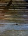
gutterby timboydwhiteComment: Too symmetrical for my taste. Interesting textures though. 6 |
| Photographer found comment helpful. |
| 09/07/2003 06:31:31 PM |
Mercy of the Seasonby jimmythefishComment: Very nice effect, great light and textures. I'd be interested to know if Gaussian Blur was applied here. Great dof, very artistic. The composition doesn't quite work for me though, the 2 main places where your eye wants to rest are not comfortable... especially right at the top of the frame. 8 |
| Photographer found comment helpful. |
| 09/07/2003 06:29:10 PM |
|
| Photographer found comment helpful. |
| 09/07/2003 06:25:47 PM |
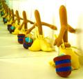
Repetitionby mgkarimiComment: I have nothing against abstracts, but I can't see what this one is trying to achieve. 4 |
| 09/07/2003 06:24:36 PM |
Pattern repetitionby justineComment: Composition needs more to hold my interest. Not really sure what the shot is trying to achieve. 5 |
| 09/07/2003 06:23:36 PM |
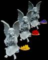
Fashion line upby AnastasiaComment: Great idea, shame the shadows are so deep in the eye sockets though. Great composition. Works well in b&w. 7 |
| Photographer found comment helpful. |
| 09/07/2003 06:17:43 PM |
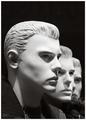
Whose Apprenticeby barahooComment: Fantastic idea, I presume this was done with mirrors. 10 out of 10 for creativity. However, you have badly blown out highlights and a very unappealing colour cast. Nothing is very sharp. Depth of field is too shallow. The title is spelt wrong (it's all part of the package!). I'd love to see this shot again when you've developed your technique. 6 |
| Photographer found comment helpful. |
Home -
Challenges -
Community -
League -
Photos -
Cameras -
Lenses -
Learn -
Help -
Terms of Use -
Privacy -
Top ^
DPChallenge, and website content and design, Copyright © 2001-2026 Challenging Technologies, LLC.
All digital photo copyrights belong to the photographers and may not be used without permission.
Current Server Time: 07/24/2026 10:19:14 AM EDT.