| Image |
Comment |
| 09/07/2003 07:17:07 PM |
Neoclassicalby magnetic9999Comment: This reminds me of a photo in the archives at DPC... it may even be the same place.
Aha, it's 'Round' by albright1, and is of the Jefferson Memorial. That one got a red ribbon because of the great use of light and shade. The crop was very effective. Although yours is an attractive shot, there is nothing here in the way of light or composition to lift this above a 6 for me. Score: 6 |
| 09/07/2003 07:11:20 PM |
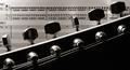
Pick-A-Repetitionby thelselComment: Very interesting take on the challenge. I'm not sure I like the headstock precisely splitting the frame in two though. Well lit. I feel that you could have thought about how to compose the shot to mirror the idea of repetition in areas of your frame other than the printed music. I don't think the repeated tuning pegs mirror the idea of repetition in the music. 7 |
 Photographer found comment helpful. Photographer found comment helpful. |
| 09/07/2003 07:05:33 PM |
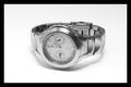
Adagioby DougPazComment: Shame it's so noisy. And it doesn't look like Adagio to me. The lighting gives a bit of glare in places. 5 |
| 09/07/2003 07:03:35 PM |
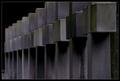
Time repeats itselfby CheerzComment: Doesn't really enter into the spirit of the challenge for me. Impressive photo though, if a little in need of sharpening. 4 |
| Photographer found comment helpful. |
| 09/07/2003 07:01:14 PM |
Smile!by joannadivaComment: Nice idea, but the lighting is resulting in a lot of glare from the balloons, and unattractive shadows on the subject's face. 4 |
| Photographer found comment helpful. |
| 09/07/2003 06:58:58 PM |
Pick a card, any card.....by gilesletherenComment: Great idea, shame about the lighting which doesn't flatter the skin tone of the hand. The thumb is exerting too much pressure which is resulting in a yellow tint at the end of the thumb. Bit too much glare on the card to the left of the frame. 6 |
| 09/07/2003 06:53:38 PM |
|
| Photographer found comment helpful. |
| 09/07/2003 06:51:54 PM |
|
| Photographer found comment helpful. |
| 09/07/2003 06:50:46 PM |
|
| Photographer found comment helpful. |
| 09/07/2003 06:49:49 PM |
|
| Photographer found comment helpful. |
Home -
Challenges -
Community -
League -
Photos -
Cameras -
Lenses -
Learn -
Help -
Terms of Use -
Privacy -
Top ^
DPChallenge, and website content and design, Copyright © 2001-2026 Challenging Technologies, LLC.
All digital photo copyrights belong to the photographers and may not be used without permission.
Current Server Time: 07/24/2026 09:31:40 PM EDT.