| Image |
Comment |
| 09/12/2003 04:00:10 AM |
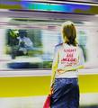
Another lifeby ccjpComment: Intriguing idea, this would have been spot on for me if the foreground person had been a young lad facing the man in tie. Instead, there is a bit of dissonance between the girl and the man in terms of being able to reflect on each other for this to work. I don't like the post-processing, which is a shame as it almost works. 6 |
 Photographer found comment helpful. Photographer found comment helpful. |
| 09/12/2003 03:52:18 AM |
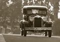
Chitty Chitty Bling Blingby thelselComment: Beautiful car, and I love the low-contrast background with the high-contrast car. As the car is on the side of the photo, it's a shame it's not driving into your negative space. I think the picture could have benefited from some sharpening. 6 |
| Photographer found comment helpful. |
| 09/12/2003 03:46:55 AM |
How data used to be storedby PaulkComment: OMG, I've taken this exact same picture... it's Chatsworth House if I'm not mistaken. In my photo, you can tell that the picture at the far end is of Henry VIII. You also seem to have picked up loads of glare. Very hard picture to expose for because of all the lights and shadows. Because of your over-exposure, you've lost loads of detail on the bookshelves. The photo could definitely do with sharpening. The composition is a bit boring... one of the shots I tried of this room involved moving to the side more and changing to portrait orientation rather than landscape so I could capture more of the ceiling and floor. I would then have been tempted to crop it so that the far end of the room would be at the bottom of my frame to emphasise the luxuriousness of the ceiling.
I found the entrance hall with the staircase a much more photogenic place... if you take a photo using a column as support, the motion blur on all the tourists is delicious. 5 |
| Photographer found comment helpful. |
| 09/12/2003 03:37:00 AM |
Over the Rainbowby rakreiComment: Shame about the pole to the left of the house and the man on the right, but great otherwise. I find rainbows quite hard to capture this clearly, and I love where it ends in your photo. Your final picture is definitely too small though, and this REALLY needs NeatImage to remove the noise. 6 |
| Photographer found comment helpful. |
| 09/11/2003 12:00:05 PM |
|
| 09/11/2003 08:42:50 AM |
From his hands to mine.by JC_HomolaComment: Interesting idea, but purple seems an odd choice of background. I wish the lighting on the tools worked better, either more well lit, or producing greater contrasts between light and shadow. 5 |
| Photographer found comment helpful. |
| 09/11/2003 08:40:59 AM |
Ole' De Sotoby briphotoComment: Very interesting tight crop. I wish more of the front were visible though. Works great in b&w. I like the glare. 6 |
| Photographer found comment helpful. |
| 09/11/2003 08:39:10 AM |
Home Sweet Homeby oskarComment: The ratio of subject to negative space doesn't quite do it for me. Don't think the shadow is effective on the left of the frame. Interesting subject though, nice light, great roof. 5 |
| Photographer found comment helpful. |
| 09/11/2003 08:33:46 AM |
|
| Photographer found comment helpful. |
| 09/11/2003 08:33:15 AM |
|
Home -
Challenges -
Community -
League -
Photos -
Cameras -
Lenses -
Learn -
Help -
Terms of Use -
Privacy -
Top ^
DPChallenge, and website content and design, Copyright © 2001-2026 Challenging Technologies, LLC.
All digital photo copyrights belong to the photographers and may not be used without permission.
Current Server Time: 07/24/2026 03:47:25 PM EDT.