| Image |
Comment |
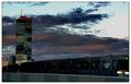
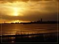
| 10/08/2003 07:53:21 AM |
sunset metroby miss parkerComment: I wish the metro were clearer, it took me a little while before I realised what it was. Great sunset and building. 6 |
| 10/08/2003 07:49:04 AM |
Small Town Courthouseby MustbelostComment: Way too much sharpening, you can see artifacting all around the building. Nice architecture. Composition doesn't strike me as very imaginative though. 5 |
 Photographer found comment helpful. Photographer found comment helpful. |
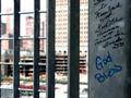
| 10/08/2003 07:44:27 AM |
Vaacumby alexvoloComment: Interesting shot, but the spelling makes me doubt whether I should take the photographer seriously. Shame about the burnt out highlights. Good composition. 6 |
| 10/08/2003 07:42:47 AM |
Tueborby TooCoolComment: Very overexposed, you've lost loads of detail in the highlights. 4 |
| Photographer found comment helpful. |
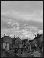
| 10/08/2003 07:41:17 AM |
Necropolisby jjbeguinComment: Very imaginative title! Great shot, tricky to expose for and you managed very well. Effective composition. Nice use of duotone. I like the textures. 8 |
| Photographer found comment helpful. |
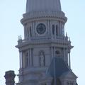
| 10/08/2003 07:39:30 AM |
Close view of timeby eunalComment: Shame about the purple fringing which is beyond your control. The wonky tower is though... why didn't you correct it? The picture is underexposed (look at the clock), and I think the composition needs to be a lot more imaginative. 4 |
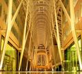
| 10/08/2003 07:31:34 AM |
In Flightby mariomelComment: Wow, fantastic use of complementary colours. Great study in contrasts. Shame about the bird that's been cut in half by the spire. An unusual take on the challenge. 8 |
| Photographer found comment helpful. |
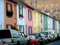
| 10/08/2003 07:26:17 AM |
Kemp Street, Brighton, UKby Apollo2077Comment: There are so many rows of coloured houses like this in Brighton that I can't help feeling there must have been a better picture somewhere. I'd have tried to find a shot without cars. The building in the top right really doesn't look good. Great idea though. 5 |
| Photographer found comment helpful. |
| 10/08/2003 07:17:15 AM |
Urban Sunsetby eikidigiComment: A very nice moody shot in duotone. Great choice of colour. 2 things bother me quite a lot here though.
1: A horizon running halfway through the frame rarely works, and it doesn't here... it looks unimaginative.
2: I really can't stand that border. I've never seen one of these borders that enhance a picture and just can't understand why people keep using them.
Score: 6
Score with above issues addressed: Probably 8 |
| 10/08/2003 07:14:28 AM |
BCE Place, Torontoby timmiComment: This picture has a lot of potential, but the orange colour cast as a result of the wrong white balance really spoils it here. This is an amazing building... did you consider shooting in portrait orientation? This would have emphasised the height as opposed to the width. There is just enough floor to let us know it's there, but I find this a bit annoying... if the floor should be in the shot, then I think more needs to be made of it. There are so many great geometric shapes here, that I personally would have made more of them, going for a little more of an arty, abstract look than a snapshot, which is what this one looks like. 5 |
| Photographer found comment helpful. |
Home -
Challenges -
Community -
League -
Photos -
Cameras -
Lenses -
Learn -
Help -
Terms of Use -
Privacy -
Top ^
DPChallenge, and website content and design, Copyright © 2001-2026 Challenging Technologies, LLC.
All digital photo copyrights belong to the photographers and may not be used without permission.
Current Server Time: 06/14/2026 10:47:21 PM EDT.