| Image |
Comment |
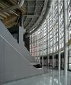
| 03/24/2004 10:10:06 AM |
Architectural Digestby dsrayComment: There are some very interesting elements to this composition, unfortunately the overall effect seems a bit chaotic. The reflections on the floor take away from the shot in my opinion. I think that the eye doen't have a natural resting place here, and that is what is needed... a focal point. |
 Photographer found comment helpful. Photographer found comment helpful. |
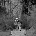
| 03/24/2004 10:06:59 AM |
The Golden Years - Springby zeuszenComment: Photo seems oversharpened, with too much texture and detail in your composition. The eye is not led to your chosen subject of the couple. It seems a bit offputting that they seem to be walking into a dead end... a bit unfortunate for a magazine aimed at older people! |
| Photographer found comment helpful. |
| 03/24/2004 10:03:57 AM |
Knowledge(drum&bass magazine)by litboltiComment: Great high-contrast shot, very idiomatic for your chosen magazine. The high-grain effect works nicely here. Not sure about the yellow tint on the lips. The reflections on the glasses take away from the effect a little for me. Great composition, I like the angle you got looking down on your subject. |
| Photographer found comment helpful. |
| 03/24/2004 10:00:59 AM |
Nickelodeonby cabaComment: Great subject, I like the reflection. The composition could be improved by not dividing your photo into two vertical halves, it's a bit of a cliche but I think that rule of thirds could have helped you here.Your subject needs more negative space to look into... I think you should have stepped back and allowed more space in the left side of the frame. I also feel that the colours are not saturated enough. The background definitely seems too grey. There is an unfortunate glare in the top-right corner of your subject which detracts a little. |
| Photographer found comment helpful. |
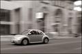
| 12/08/2003 06:32:54 PM |
VW Beetleby samtimesComment: Beautiful... shame the car is moving out of the frame though instead of into it. |
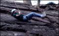
| 12/04/2003 06:30:14 AM |
This Wasn't Supposed to Happen!by DiamondPeteComment: Critique Club:
An interesting use of motion-blur, and certainly fits the challenge.
However, the blur seems accidental rather than deliberate... the only thing which is reasonably sharp in the shot is his bum, which I'm sure is not meant to be the focus of the picture. If you'd panned the camera the follow the movement of his face, which has a great expression, I'm sure the photo would have worked really well. That way the viewer's eye would be drawn to the face first, and it is his expression that would have made the photo work excellently as a 'surprise' shot.
Compositionally the photo seems a bit chaotic. The background is very distracting and makes the photo look more like a snapshot because the feeling is that the photographer didn't put a lot of thought into how it would affect the final composition. The sky also looks like an afterthought... it's usually a good idea to place horizons or skies on a 3rd junction (rule of thirds). This ties in with another reason I think the composition doesn't work for me... the person is centred in the frame, which draws attention to his bottom again, as that is the part of him which is in the centre of the frame. If you insist on centring your subject, be aware that the eyes should be where the viewer's eye will want to go first, so centre the eyes/face in your frame.
I would have been tempted to crop the picture keeping the top-left quarter. This would give you his head, torso and upper legs. I would crop out the sky. This would compositionally focus more on his face, and introduce a nice top-left to bottom-right diagonal in the composition.
In conclusion: in my opinion this picture is a little too much like a snapshot and needs more thought on it's composition. The motion blur is a nice touch, but we need more sharpness in the shot... this would work well if the face was sharp. |
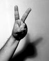
| 12/02/2003 10:39:44 AM |
Victory... or only shades Mr. Bushby cimarron98Comment: Critique Club:
I'm not sure I really understand the intention behind this photo. Is this the V for victory sign as used by Churchill? Where is the irony that the title hints at? Is this a pun on the title, where the shade is the shadow thrown by the hand? For propaganda, the image is not in any way hard-hitting enough as the message is unclear and ambiguous.
I'm not a fan of the burnt out highlights on the left side of the frame, and the noise levels in the shadow detract from the picture IMO.
The black and white works well here, and I like the tonal contrasts that can be found in the hand and arm.
In conclusion, I don't think the photo's message is communicated clearly enough for this to be an effective example of propaganda. I think you also need to watch out for overexposed highlights... I loved your shot of the child with dog which also sadly had burnt out highlights. |
| Photographer found comment helpful. |
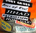
| 12/01/2003 12:23:27 PM |
Black & White(thinking) & Red (causes suffering) all overby vrphotosComment: Critique Club:
A powerful piece of propaganda... although my own take on this picture is one of awareness rather than propaganda! The line is very fine, and maybe depends on whether you believe it or not. Any political advertising you don't believe in can be called propaganda I guess.
Anyway... the idea is a good one. A complex argument is simplified into a hard hitting image. I like the fact that the pro-war sound bites are in black and white, symbolic of the way that the pro-war contingency seemed to perceive the situation. The fragile parcel was a superb idea, a clever way of putting across the fact that the war was not in people's best interests. The 'Handle with care' sticker strongly implies that the opposite was in fact true. The picture really carries across the obsessiveness with looking at the pro-war arguments without considering the whole picture.
As far as the photography goes, the picture doesn't have quite enough attention to detail for my taste. For example, I'd have liked the background a smooth orange with no shadows and distracting detail.
Also, the edges of the paper used for the pro-war slogans seem a little sloppy. The highlights seem a little burnt out at the bottom right of the frame. A point that irks me about the photo is that I can't tell what the pro-war slogans are... are they books? The problem here is that they don't automatically convey weight to me. Could this have been solved by using a cartoon-like weight with the slogans on?
The base that the parcel is resting on also seems out of place. It really needs a smooth, non-distracting texture.
In conclusion, an inspired idea, a great piece of propaganda which just needs a little more polish. I personally wasn't sure about your title which seems rather unwieldy. Message edited by author 2003-12-01 12:25:30. |
| Photographer found comment helpful. |
| 11/19/2003 04:49:45 AM |
|
| Photographer found comment helpful. |
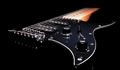
| 11/16/2003 07:18:18 PM |
Last Tune Before the Unknownby alexvoloComment: Critique Club:
I'm glad I got this picture to critique... I liked it the first time I saw it, and gave it an 8. I'm a guitarist, so good pictures of guitars are particularly meaningful to me.
The lighting is what makes this photo stand out, you exploited the black paintwork and black background to emphasise the ambiguity of the body's shape. Only the white scratch plate gives away the shape of the guitar. Your title hints that this is symbolic of the state of mind of the musician. I particularly like the way the bridge is reflected in the black paintwork. A nice touch.
The minor niggles I would draw attention to in this photo are:
There is nowhere near enough sharpness in this picture... did you try unsharp mask? Was the photo taken with a tripod? Was it steady? Did you use a remote control/ shutter timer?
The amount of negative space at the top and at the bottom of the subject is uneven. I'd have liked more negative space below what we can see of the guitar.
The fretboard is just a little too orange for my liking... I'd have desaturated the picture a tad.
In general, a good photo where you imaginatively took advantage of your subject's colour by using a similarly coloured background to explore ambiguity of shape and played with the viewer's ability to imagine what is missing. Message edited by author 2003-11-16 19:19:11. |
Home -
Challenges -
Community -
League -
Photos -
Cameras -
Lenses -
Learn -
Help -
Terms of Use -
Privacy -
Top ^
DPChallenge, and website content and design, Copyright © 2001-2026 Challenging Technologies, LLC.
All digital photo copyrights belong to the photographers and may not be used without permission.
Current Server Time: 07/26/2026 08:55:06 AM EDT.