| Image |
Comment |
| 04/01/2004 11:34:36 AM |
Sweetie Pieby PaigeComment: Very nice shot, good character, well composed, good crop. Her hat seems much sharper than her face though, which leads my eye away from the face. IMO the eyes need to be the sharpest thing in the frame, as this is the point of focus. The face looks a little too smooth/ blurred, possibly as a result of NeatImage. Sometimes this is a nice effect on older models, but children don't need it. |
 Photographer found comment helpful. Photographer found comment helpful. |
| 04/01/2004 11:31:28 AM |
Lazy on a Sunday Afternoonby TiberiusComment: Interesting shot... perhaps a little too like a snapshot. Slight overexposure resulting in burnt out highlights. The boy doesn't seem to be very sharp, and there is bad artifacting everywhere, possibly as a result of applying sharpening in PS to a photo that wasn't too sharp to start with. This particularly affects the texture of sand. Perhaps a little too much red overall. I think the main problem with this shot for me is that the viewer's eye is pulled in different directions. The two subjects are both looking out of the frame in different directions so there is no clear point of focus. |
| Photographer found comment helpful. |
| 04/01/2004 11:27:50 AM |
Concentrationby NazgulComment: Nice shot, very expressive tongue. Nicely blurred trees in the background. Not quite sure about your choice of blue here though. Great arms, but I'm not convinced by the crop. Well exposed. |
| Photographer found comment helpful. |
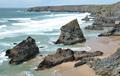
| 04/01/2004 11:24:55 AM |
favourite coastlineby nordicComment: This shot doesn't do much for me I'm afraid. The sea is a little overexposed resulting in burnt out highlights. The overal picture looks a bit washed out, I think it could benefit from a bit more contrast. The picture could have been much sharper... maybe this is an issue with your camera. The dof seems a bit narrow, the background is less sharp than the foreground. Difficult to see why this happened, given that it is shot in bright conditions. I think you would have been better off focusing on a mid-point between the foreground and background to catch everything in focus. The composition in general seems a bit haphazard, maybe rule of thirds might have helped here. |
| Photographer found comment helpful. |
| 03/31/2004 09:57:07 PM |
Fish Out Of Waterby e301Comment: A clear winner! Nothing to fault here whatsoever... great lighting, good range of tones, great idea. I love the subtle shades of red. Very accomplished. 10 |
| Photographer found comment helpful. |
| 03/31/2004 09:44:28 PM |
|
| 03/31/2004 09:32:10 PM |
Tee Offby HRoxasComment: Shame about the blue noise in your background. I'm sure this could have been sorted with a curves adjustment. Great pic though. |
| 03/31/2004 09:29:46 PM |
|
| Photographer found comment helpful. |
| 03/31/2004 09:19:52 PM |
the fogby bal pgComment: I think I've missed something... what is out of place here? |
| 03/31/2004 09:00:45 PM |
Separationby lightpro1Comment: Not really sure what to make of this one... not being American, I had to read everything to work out what was being represented. So, I presume we have here a split between church and state. This does indeed look like separation, but not like out of place. What is out of place here?
Very sharp photo though... |
| Photographer found comment helpful. |
Home -
Challenges -
Community -
League -
Photos -
Cameras -
Lenses -
Learn -
Help -
Terms of Use -
Privacy -
Top ^
DPChallenge, and website content and design, Copyright © 2001-2026 Challenging Technologies, LLC.
All digital photo copyrights belong to the photographers and may not be used without permission.
Current Server Time: 07/27/2026 12:56:47 AM EDT.