| Image |
Comment |
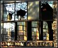
| 04/15/2004 08:53:07 AM |
Fixer Upperby wickedpeteComment: Some interesting elements here, but the overall effect is a bit chaotic. The burnt out highlights don't work too well. I like the colours and textures. I'd have straightened everything in PS using 'distort' so all the lines are parallel to the edge of the picture. |
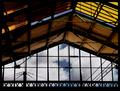
| 04/15/2004 08:51:15 AM |
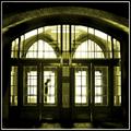
View from platform Bby jjbeguinComment: Some beautiful colours and lines here. I think the sky doesn't quite do it for me though... this picture could be stunning with the right sky. The exposure is very effective leaving just the right amount of shadow detail. |
 Photographer found comment helpful. Photographer found comment helpful. |
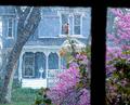
| 04/15/2004 08:49:28 AM |
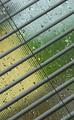
Spring Shower Through Old Glassby vtruanComment: Some interesting textures and colours here. I'd have been tempted to make a tighter crop so you see the frame but not the lower right pane. Not enough sharpness here for my taste. |
| Photographer found comment helpful. |
| 04/15/2004 08:47:59 AM |
cloudy dayby TLL061Comment: Some nice colours, textures and lines. But there's not enough here to keep me interested, and the composition doesn't convince me. The diverging diagonals seem badly thought out. |
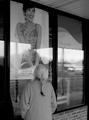
| 04/15/2004 08:46:43 AM |
Longing for Springby jmritzComment: Not quite sure what you were going for here, the overall effect is one of a snapshot. I think it's the glare and reflections in the windows that let the photo down. It's not entirely clear what your point of focus is... is it the woman looking in the window? The writing? The model in the poster? The arrangement of all these elements seems haphazard and not pleasing to the eye. |
| Photographer found comment helpful. |
| 04/15/2004 08:42:32 AM |
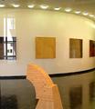
Art Gallery at Long Island Universityby LesyaComment: Are we looking though a window? The challenge stated that the frame had to be visible. Otherwise the window is a small one on the left of the frame which is definitely not the point of focus. This doesn't meet the challenge for me. |
| 04/15/2004 08:40:42 AM |
|
| Photographer found comment helpful. |
| 04/15/2004 08:39:32 AM |
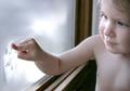
Window Artby SonifoComment: Nice portrait, what a huge shame about the burnt out highlights near the nose. |
| Photographer found comment helpful. |
| 04/15/2004 08:37:01 AM |
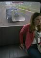
Back of the busby DefyTimeComment: Not sure what you're trying to achieve here. I feel like the shot is trying to tell a story, but it's not clear enough. The view out of the window is too cluttered, and the reflections are very offputting. I don't like that part of your model's face has been cropped off. |
| Photographer found comment helpful. |
| 04/15/2004 08:33:59 AM |
Denied Entry by leafComment: Intriguing shot, possibly looks a little too 'NeatImaged' for me. Well exposed, bearing in mind the extremes of tones. I like the blurred figure. Atmospheric choice of colour. Effective composition. |
| Photographer found comment helpful. |
Home -
Challenges -
Community -
League -
Photos -
Cameras -
Lenses -
Learn -
Help -
Terms of Use -
Privacy -
Top ^
DPChallenge, and website content and design, Copyright © 2001-2026 Challenging Technologies, LLC.
All digital photo copyrights belong to the photographers and may not be used without permission.
Current Server Time: 07/27/2026 12:18:10 PM EDT.