| Image |
Comment |
| 06/06/2007 05:33:43 AM |
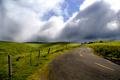
Road To The Topby cogeroxComment: Striking shot, shame about the overexposed clouds. There's certainly enough shadow detail, I would definitely have brought the overall exposure down to keep detail in the highlights. Not sure about the placement of the horizon... it doesn't look like it was a deliberate decision to place it just below centre. PP has enhanced the textures of what may have been an okay photograph to one with more impact. |
 Photographer found comment helpful. Photographer found comment helpful. |
| 06/06/2007 05:31:01 AM |
Angieby dsa157Comment: Not sure about the composition, why chop off a small part of the ear? I think more creative use of negative space could have transformed the photo, perhaps by including more space to the right and top. The shoulder works well in the composition tbough. The hair is a little messy, especially around her parting. The expression is not flattering, the crease between her eyes places a wall between her and the viewer. The mouth also seems to express displeasure. The face is slightly overexposed, especially the forehead and cheecks. |
| Photographer found comment helpful. |
| 06/06/2007 05:26:42 AM |
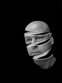
In the Shadowsby kris11Comment: Not sharp enough, the eyes in particular should be razor sharp. Perhaps some USM? The stripey light is a nice idea, but I'm not fond of the mask effect on the eyes. The forehead looks unnaturally smooth. The expression is not too inspired, particularly the mouth. The background looks a little too burnt in, a little texture would help. Composition feels a little unbalanced, perhaps rule of thirds could have helped? |
| Photographer found comment helpful. |
| 06/06/2007 05:23:42 AM |
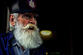
years at seaby simplesilentComment: Every photographer's portfolio should contain a roughly textured fisherman, and here's yours! The PP is a little gratuitous for my taste though, especially in the texture of the clothes which distracts the eyes from the face. The crop could be much tighter, maybe to the bottom of the beard. The current crop takes attention away from the eyes, especially as the eyes aren't using rule of thirds. Shame the circular logo on the cap has been chopped off... I would definitely have included that rather than the upper torso. The light in the background is not good at all and spoils the photo significantly. Other than that, interesting expression and composition. |
| Photographer found comment helpful. |
| 10/31/2006 08:40:38 AM |
|
| Photographer found comment helpful. |
| 07/23/2006 10:54:42 PM |
|
| 07/23/2006 06:55:29 PM |
|
| Photographer found comment helpful. |
| 05/23/2006 06:29:16 PM |
|
| 05/18/2006 07:44:34 AM |
Etherealby Dax-Comment: There are definitely too many flower photos in the world, they get tired very quickly. But this shot is fantastic and really says something new. I love your vision! |
| Photographer found comment helpful. |
| 05/18/2006 07:21:35 AM |
|
| Photographer found comment helpful. |
Home -
Challenges -
Community -
League -
Photos -
Cameras -
Lenses -
Learn -
Help -
Terms of Use -
Privacy -
Top ^
DPChallenge, and website content and design, Copyright © 2001-2026 Challenging Technologies, LLC.
All digital photo copyrights belong to the photographers and may not be used without permission.
Current Server Time: 07/21/2026 06:25:03 PM EDT.