| Image |
Comment |
| 05/19/2004 08:44:40 AM |
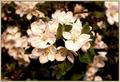
A Center Pieceby TikicharmComment: Interesting picture, I think you could have adjusted the levels in PS to show much more of the highlight detail which almost looks blown out the way you've presented it. Adjusting the hue and saturation of the greens would have been good as well, as they look a bit dull here. Shallow dof works well here. More sharpness would have been good... is there any USM here? |
 Photographer found comment helpful. Photographer found comment helpful. |
| 05/19/2004 08:42:19 AM |
Mollyby indianzfanComment: Very entertaining pet photo. Shame about the burnt out highlights, but you had a big tonal range to capture here. Try setting your camera's contrast settings to 'minimum', this will enable it to capture more highlight and shadow detail. If you have the latest PS, you can also rescue shadow and highlight detail. Otherwise, use a technique known as Contrast Masking... look it up in Google. More sharpness would have been good. |
| Photographer found comment helpful. |
| 05/19/2004 08:37:47 AM |
Contemplationby jimmyn4Comment: Cute dog, I'm presuming that's his home behind him, so I like the context that the background provides. It's a little too much like a snapshot for my taste, something imaginative needs to happen here to make it more than just a personal pet photo. |
| Photographer found comment helpful. |
| 05/19/2004 08:35:59 AM |
tricky-tracksby scwortmanComment: Nice idea, but makes me feel a bit dizzy as the horizontal lines aren't level. I'm not sure you caught this at the right time of day, as the shadow doesn't really work for me here. Needs an extra element in the shot to push this a level higher. |
| 05/19/2004 08:33:58 AM |
Looking both waysby eirasiComment: Interesting idea and composition... I'd have liked the overall gamma a little higher though, with more shadow detail. Wonderful mood created by this shot. |
| Photographer found comment helpful. |
| 05/19/2004 08:30:37 AM |
Just being my cute selfby RickDNComment: Cute portrait... the shallow dof works well, and the flowers in the background really add to the shot. The photo really complements the girl... there is just the right amount of sharpness and the saturation is perfect. |
| 05/19/2004 08:29:01 AM |
quiet reflectionby ursulaComment: Absolutely beautiful, but not really in the spirit of this challenge. The edge of the lake may be in the middle, but the focal point of this photo is not in the centre. |
| Photographer found comment helpful. |
| 05/19/2004 08:25:07 AM |
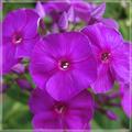
Phloxby spydrComment: I REALLY don't like this border, which detracts heavily from the photo. I just can't understand why it was used here. Flowers are very nice, background works very well. Great colours and saturation. Exposure is spot on. Have to take off points for that border though, as it stops me focusing on the photo. |
| Photographer found comment helpful. |
| 05/19/2004 08:23:24 AM |
Green Essenceby birgirComment: Nice and simple... apple is well lit, high-key background works well. You really have captured the essence of this apple. I like the apple's shadow. |
| Photographer found comment helpful. |
| 05/19/2004 08:13:39 AM |
Marble Madnessby DonatienComment: Not sure that selective desat really brings anything to this picture. It looks more like a gimmick here. High levels of noise and nothing is particularly sharp. Composition seems a tad tilted. |
| Photographer found comment helpful. |
Home -
Challenges -
Community -
League -
Photos -
Cameras -
Lenses -
Learn -
Help -
Terms of Use -
Privacy -
Top ^
DPChallenge, and website content and design, Copyright © 2001-2026 Challenging Technologies, LLC.
All digital photo copyrights belong to the photographers and may not be used without permission.
Current Server Time: 07/27/2026 07:21:35 PM EDT.