|
|
|
Showing 311 - 320 of ~540 |
| Image |
Comment |
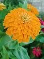
| 05/20/2003 02:01:33 PM | Orange and Green Wildflowerby caroleeComment: A very straightforward, head-on macro shot of a blossom. There's nothing that particularly excites me about it, but it's executed in a very technically-proficient way, so I have to give props for that. :-> Would make a good mousepad or coaster, I think. |  Photographer found comment helpful. Photographer found comment helpful. |
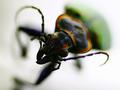
| 05/20/2003 01:57:50 PM | Charge!by dadas115Comment: oh, WOW. Great macro. 9. I freely admit that the only reason it didn't get a 10 from me is my own, personal, idiosyncratic preference for a slightly deeper DOF in this case - the blur sets in so soon that I start thinking I need to adjust my glasses. |
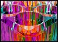
| 05/20/2003 01:56:52 PM | Prism²by crabappl3Comment: A truly ambitious concept, executed fairly well ... but I rated this 9 instead of 10 because the sheer muddle of all the vertical bars of color is mildly vertigo-inducing. Maybe a few more-defined stripes instead of so many tiny blades of colored grass (as it were) would have peaked at 'perfect' for me. Or maybe not. Good shot, though! | | Photographer found comment helpful. |
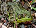
| 05/20/2003 01:53:31 PM | Green Creatureby mullany1957Comment: NICE crisp shot! I've shot frogs, and I know how tough it can be to get them to cooperate. Only the straightforward, almost journalistic style of composition keeps this a 9 from me instead of a 10 - if it had seemed more 'arty,' as it were, if there were an emotional tone or a visceral reaction given (rather than just \"Oh, wow, what an outstanding photo of a bullfrog!"), I would have tenned it. Still, well done! | | Photographer found comment helpful. |
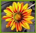
| 05/20/2003 01:50:57 PM | Orange Green and Purpleby sg10Comment: Lovely macro; good choice to have the entire flower sharp and the background fuzzed. Looks like something from a seed catalog, almost - advertising the plant or breed. | | Photographer found comment helpful. |
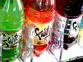
| 05/20/2003 11:12:35 AM | Drink to colorsby BeckyComment: The pixelization and overprocessing distracts from the image, and the composition in general isn't particularly interesting (no particular place the eye is directed). |
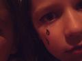
| 05/20/2003 10:19:33 AM | Tears of Innocenseby ska120sComment: It's tight, dark, and overly, self-consciously precious, IMHO. I'd have sacrificed a little size for a bit more sharpness, and perhaps cropped away the distracting extra cheek on the left there. Well, that and added a bit more light. But that's me. :-> Also, I really don't see how this fits the challenge, particularly, so I'm leaving room ahead of this in my marks for things that made the color central. |
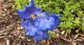
| 05/20/2003 10:18:10 AM | purpleby Crafty SueComment: The focus on the iris is a little muddy, and there's no real center of attention for the photograph, to me - nothing to look at, for the picture to be about. |
| 05/20/2003 10:17:04 AM | secondary color mixtureby DustinComment: I really don't get how this applies to the theme at all, so I have to grade it down to leave room at the top for folks who *did* shoot to theme. Also, I find the pixelation/weave texture, as well as the overexposure and lack of middle tones, distracting. |
| 05/20/2003 10:15:45 AM | | | Photographer found comment helpful. |
|
Showing 311 - 320 of ~540 |
Home -
Challenges -
Community -
League -
Photos -
Cameras -
Lenses -
Learn -
Help -
Terms of Use -
Privacy -
Top ^
DPChallenge, and website content and design, Copyright © 2001-2026 Challenging Technologies, LLC.
All digital photo copyrights belong to the photographers and may not be used without permission.
Current Server Time: 07/27/2026 10:47:18 PM EDT.
|