| Image |
Comment |
| 05/28/2003 09:43:02 AM |
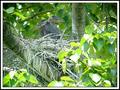
Heron Homeby SwashbucklerComment: I'm going to have to grade this down a bit for not being about YOUR home, IMHO. This is of course just my own (perhaps over-narrow) interpretation of the challenge, but I have to draw lines somewhere to make judging easier, and I feel people who tried to shoot their own home deserve a better chance at high scores. |
 Photographer found comment helpful. Photographer found comment helpful. |
| 05/28/2003 09:42:55 AM |
Mobile homeby marboComment: I'm going to have to grade this down a bit for not being about YOUR home, IMHO. This is of course just my own (perhaps over-narrow) interpretation of the challenge, but I have to draw lines somewhere to make judging easier, and I feel people who tried to shoot their own home deserve a better chance at high scores. |
| Photographer found comment helpful. |
| 05/27/2003 09:36:21 AM |
Urban Abstractby eloiseComment: Welp, each photo I submit to a challenge is doing better than the last ... now to see if I can consistently break 5. :-> I'm certainly learning a lot. Next goal - to finish halfway through the pack! |
| 05/27/2003 08:46:14 AM |
Beaute Naturelle by lmhrComment: There's nothing blatantly wrong with this shot, but unfortunately there's nothing particularly enthralling about it, either. Her expression is blandly calm, and doesn't add much. She's a pretty girl, and it's a decent photo of a pretty girl, but ... 7. |
| 05/27/2003 08:45:11 AM |
Duotone Roseby scrooslooseComment: This looks full-color to me, so I have to grade it down a bit to leave room at the top for more 'traditional' duotone interpretations. |
| 05/27/2003 08:44:37 AM |
The Light Insideby xertionComment: Ok, I see three colors here - black, white, and blue. I'm grading it down a bit to leave room for more traditional 'duotone' interpretations. |
| Photographer found comment helpful. |
| 05/27/2003 08:44:01 AM |
Black & Copper Baroqueby amonteforteComment: Ok, it's not a duotone when you use multiple colors that aren't either black or white (there's a sepiaish color, and a red one, here). To me. So I'm grading it down to leave room for things that fit the theme better. |
| 05/27/2003 08:43:16 AM |
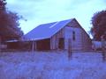
Barnby David EyComment: This doesn't look like an actual duotone to me, rather like a color shot you turned down most of the brightness on the other color channels for. I have to grade it down a bit to leave room for things that more properly fit the topic. |
| Photographer found comment helpful. |
| 05/23/2003 04:58:51 PM |
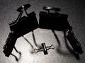
Hommage à Film Noirby GordonComment: I love that. It's wildly funny. :-> Especially with the difference in pose between those 'standing' and the one prone in the middle. It's hard to give inanimate objects personality, but this succeeds. |
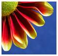
| 05/21/2003 01:03:41 PM |
Petals by agwrightComment: So when will you have a version of it on DCPrints, so I can give my mom a copy? :-> |
| Photographer found comment helpful. |
Home -
Challenges -
Community -
League -
Photos -
Cameras -
Lenses -
Learn -
Help -
Terms of Use -
Privacy -
Top ^
DPChallenge, and website content and design, Copyright © 2001-2026 Challenging Technologies, LLC.
All digital photo copyrights belong to the photographers and may not be used without permission.
Current Server Time: 07/28/2026 12:49:04 AM EDT.