|
|
|
Showing 181 - 190 of ~540 |
| Image |
Comment |
| 05/29/2003 05:03:54 PM | |  Photographer found comment helpful. Photographer found comment helpful. |
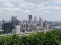
| 05/29/2003 04:58:38 PM | Pittsburgh, Pennsylvaniaby gpflmanComment: The composition and choice of angle elevate this over the other skyline shots in the competition, imho, giving it a bit more personality. |
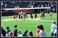
| 05/29/2003 04:12:49 PM | Crossing Home, Headed Home...by GeneralEComment: 5. Fits the theme well enough, and there are no blatant 'you suck!' flaws to it, but neither does it really grab me for any reason at all. For reasons of composition, cropping, or subject choice, it's just a photo, and doesn't do especially much for me, aesthetically.
None of the people are composed to be central, and yet it's not wide enough for the sweep of the ballpark to be the star, either. A better focus on any of the people might have helped. | | Photographer found comment helpful. |
| 05/29/2003 04:12:03 PM | Home sweet home with a green front yardby pedroviegasComment: 5. Fits the theme well enough, and there are no blatant 'you suck!' flaws to it, but neither does it really grab me for any reason at all. For reasons of composition, cropping, or subject choice, it's just a photo, and doesn't do especially much for me, aesthetically.
The colors are so luminously oversaturated, the lighting so harshly contrasting between 'bright on the barge' and 'black cliffs' (though I do like the colored lichen back there!), and the lack of good enough focus for the people to be more than impressionistic daubs, that it somehow fails to be about anything in particular. Good idea, though, and an interesting subject. |
| 05/29/2003 04:10:54 PM | Protect your sweet home !by bosniakComment: 5. Fits the theme well enough, and there are no blatant 'you suck!' flaws to it, but neither does it really grab me for any reason at all. For reasons of composition, cropping, or subject choice, it's just a photo, and doesn't do especially much for me, aesthetically. | | Photographer found comment helpful. |
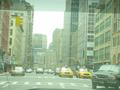
| 05/29/2003 04:10:44 PM | Where they once stoodby soggy1Comment: 5. Fits the theme well enough, and there are no blatant 'you suck!' flaws to it, but neither does it really grab me for any reason at all. For reasons of composition, cropping, or subject choice, it's just a photo, and doesn't do especially much for me, aesthetically.
It looks like I'm viewing it through a sheet of seafoam-green cellophane (or the back window of a car, which seems more likely in a logical sense). The faint lines across it from the rear defroster likewise distance from the subject, and in the field of view there's nothing actually in focus or compositionally central to draw the attention. A closer crop on the cab(s) might have been a more interesting shot, perhaps cropped so it's a vertical frame, echoing the lines of the buildings behind them? |
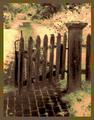
| 05/29/2003 04:09:19 PM | The Garden Gateby fleenkComment: 5. Fits the theme well enough, and there are no blatant 'you suck!' flaws to it, but neither does it really grab me for any reason at all. For reasons of composition, cropping, or subject choice, it's just a photo, and doesn't do especially much for me, aesthetically.
I could have graded this much higher if it weren't so pixelated and overprocessed; the basic subject choice is quite appealing to me (if lit similarly, shot similarly, and left crisp, with perhaps a softer focus on everything past the fence). |
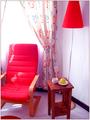
| 05/29/2003 04:08:34 PM | Mi Casa es Mi Casa (Muuaaahhhhs!)by adriannayusofComment: 5. Fits the theme well enough, and there are no blatant 'you suck!' flaws to it, but neither does it really grab me for any reason at all. For reasons of composition, cropping, or subject choice, it's just a photo, and doesn't do especially much for me, aesthetically.
It's not about any one particular thing in the frame, unfortunately, and the combination of bad focus everywhere but the table's contents and the oddly saturated color seem to distract rather than accentuating. |
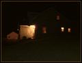
| 05/29/2003 04:07:55 PM | Country Living = Dark Nightsby mcraelComment: 5. Fits the theme well enough, and there are no blatant 'you suck!' flaws to it, but neither does it really grab me for any reason at all. For reasons of composition, cropping, or subject choice, it's just a photo, and doesn't do especially much for me, aesthetically.
A disembodied, lit section of the inside of a cube seems to hang in space strangely, with nothing to look at inside it. |
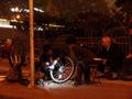
| 05/29/2003 04:07:29 PM | A repair joint where cyclists' wheels call homeby donpramComment: 5. Fits the theme well enough, and there are no blatant 'you suck!' flaws to it, but neither does it really grab me for any reason at all. For reasons of composition, cropping, or subject choice, it's just a photo, and doesn't do especially much for me, aesthetically.
The deeply-saturated color everywhere but in the flashlight beam makes the rest of the image recede, blending into itself muddily, and what's framed in the white light isn't compositionally coherent. Maybe a little more post-camera tweaking to adjust the color/contrast might have made it pop more. | | Photographer found comment helpful. |
|
Showing 181 - 190 of ~540 |
Home -
Challenges -
Community -
League -
Photos -
Cameras -
Lenses -
Learn -
Help -
Terms of Use -
Privacy -
Top ^
DPChallenge, and website content and design, Copyright © 2001-2026 Challenging Technologies, LLC.
All digital photo copyrights belong to the photographers and may not be used without permission.
Current Server Time: 07/27/2026 04:15:14 PM EDT.
|