| Image |
Comment |
| 06/13/2003 02:33:03 PM |
|
 Photographer found comment helpful. Photographer found comment helpful. |
| 06/13/2003 02:32:18 PM |
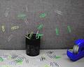
Paperclipsby sagestudioComment: A 9, though it could have been ten for me if it didn't seem so blown-out, exposure-wise. As it is, it's clinging to the bottom of nine with its fingernails, to me; however, the overall image is so appealing that I had to grade it up from 8 on beauty. |
| Photographer found comment helpful. |
| 06/13/2003 02:31:27 PM |
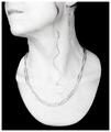
Ammoby casualguyComment: A definite 9 from me; good colors, good lighting (good contrast with background), and something about the composition just makes it pop at me and want to be looked at. I bet people are going to complain about the texture on the bands, though. :-> |
| 06/13/2003 02:30:46 PM |
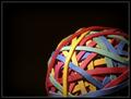
Wastelandby jkiolbasaComment: A 9 from me. I love how it almost looks like a shingle-sided house. |
| Photographer found comment helpful. |
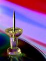
| 06/13/2003 02:30:22 PM |
To the Pointby TerryGeeComment: Wow, a definite 9. I love the swirling saturated colors, and the transparancy (and reflection) of the body of the tack. |
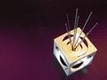
| 06/13/2003 02:29:46 PM |
Abstract Graphite Sculpture (Pencil Lead Holder)by severinComment: Ow, wow. 9. It just pops for me, and technically I can find no real fault. I like the textured background (under-ground?); to me it adds more than a flat color would. The angle shooting down into the cube also lines up the varying circles in a way I find very appealing. If I had to nitpick anything I'd say that the bright bits of the insides of the bottom circles are maybe a *little* too bright for my tastes. |
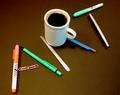
| 06/13/2003 02:27:28 PM |
Office paraphernalia or is it ....?by hughletherenComment: Definintely a ten from me, though admittedly it scores higher on concept than execution. :-> The execution's all right, but not Freaking Amazing. Concept is really, really cute, though. |
| Photographer found comment helpful. |
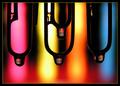
| 06/13/2003 02:26:45 PM |
The Highlighted Area by inspzilComment: Wow. A 10. Gorgeous focus (both the sharps and the blurs - those markers in the background look like neon tubes!), and lovely high-contrast lighting. |
| Photographer found comment helpful. |
| 06/12/2003 02:22:13 PM |
Playboyby iconsueComment: Playboy never has shots like this on the cover, unfortunately. Too abstract and arty. |
| 06/12/2003 02:18:59 PM |
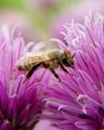
DISCOVER "Killer Bees"by severinComment: If you'd called it 'Nature' or 'Natural Geographic,' I could rate it higher; Discover magazine tends recently to have much more manipulated and abstract covers. |
Home -
Challenges -
Community -
League -
Photos -
Cameras -
Lenses -
Learn -
Help -
Terms of Use -
Privacy -
Top ^
DPChallenge, and website content and design, Copyright © 2001-2026 Challenging Technologies, LLC.
All digital photo copyrights belong to the photographers and may not be used without permission.
Current Server Time: 07/27/2026 08:54:29 PM EDT.