| Image |
Comment |
| 06/22/2009 12:02:54 AM |
Mysticby JutildaComment: Scored highly as it should have. Good job! |
 Photographer found comment helpful. Photographer found comment helpful. |
| 06/21/2009 10:50:45 PM |
State-Cap.jpgby JerseyGenieComment: Yea, I hate trying to get the meat out of those shells. It's sooooo tasty, but an awful lot of work for the amount of meat in them. |
| Photographer found comment helpful. |
| 06/20/2009 10:09:45 PM |
|
| Photographer found comment helpful. |
| 06/20/2009 02:13:52 PM |
|
| Photographer found comment helpful. |
| 06/20/2009 02:12:30 PM |
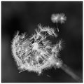
Dandyby MelethiaComment: You are really doing some fantastic b/w's. Are you using Nik Silver Efex on these? I'm trying to improve my b/w's, and I have improved, but I can't seem to achieve anything that looks even close to this. |
| Photographer found comment helpful. |
| 06/19/2009 11:49:06 PM |
|
| Photographer found comment helpful. |
| 06/19/2009 07:12:37 PM |
|
| Photographer found comment helpful. |
| 06/19/2009 11:42:20 AM |
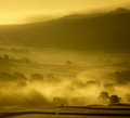
Earlyby ChinarosepetalComment: I like this because of the wonderful fog and the dimension it gives to this landscape. Composition-wise, I felt my eye being drawn both to the mountains and to the line of fog shrouded trees in the foreground. Neither stood out as the main subject over the other. I'm not a big fan of square crops and I will only use one myself when nothing else seems right for it. Not sure if it was the best here or not. I'd have to see the uncropped image. The overall appearance struck me as similar to a shot I posted in a side challenge recently.

The gold tone might be a little strong for some viewers, but my own entry is a rip-your-eyes-out-of-the-sockets color, so who am I to nitpick that aspect?
In spite of some aspects that did not work for me, this got a reasonably high vote from me because the aspects that I did like worked very well for me. |
| Photographer found comment helpful. |
| 06/19/2009 11:27:15 AM |
~ Serenity ~by Ja-9Comment: I'm not a big fan of floral shots, mostly because I find it is just too easy to get an attractive photo of a pretty flower, so when I vote on one, there has to be something well done to make it stand out to me. The composition is spot-on rule of thirds and leads my eye nicely through the frame. The treatment and light is nice, being just soft enough to be pleasing, but still has lots of details showing. (I love to see lots of fine detail). The border didn't have much effect on me one way or another, but it probably does add a nice touch. I think the objection to it may be that it overlays with the actual subject matter. I really can't find anything to nitpick about here, and I gave this a very high vote. |
| Photographer found comment helpful. |
| 06/19/2009 11:17:45 AM |
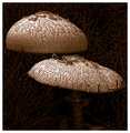
Nature's umbrellaby KelliComment: I like the tones and the way the light is hitting this. There is, of course, a lot of sepia being seen in this challenge, but when working on my own entry, I realized this is because brownish tones enhance many images quite well. It is just what works. The distinctive appearance of the caps of the 'shrooms suggests to me that you may have used a Topaz product on this. About my only real nitpick is that I find it cropped a little too tight for my own preferences. I gave this one a fairly high vote. |
| Photographer found comment helpful. |
Home -
Challenges -
Community -
League -
Photos -
Cameras -
Lenses -
Learn -
Help -
Terms of Use -
Privacy -
Top ^
DPChallenge, and website content and design, Copyright © 2001-2026 Challenging Technologies, LLC.
All digital photo copyrights belong to the photographers and may not be used without permission.
Current Server Time: 06/24/2026 12:09:32 AM EDT.