| Image |
Comment |
| 03/10/2008 08:57:58 PM |
Which way is up?by abapnaComment: <---Maybe that way?
Nice idea for the theme, though I find the photo to be very soft and I think a subject like this begs for sharp crusty details. (This is the underside of a stairwell or fire escape, right? Maybe?) |
| 03/10/2008 08:53:07 PM |
|
 Photographer found comment helpful. Photographer found comment helpful. |
| 03/10/2008 08:52:02 PM |
Alien Liberator, in a Full-Tilt Chase...by supernaughtComment: Well, I guess in space, any direction is up, down,... or tilted. I'll give you credit for a clever take on the theme. (Though a little bit of a shoehorn)
Pretty good, and nice lighthearted entry, but a bit on the dark side. |
| Photographer found comment helpful. |
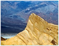
| 03/10/2008 07:04:38 PM |
Zabriskie Pointby EstimatedEyesComment: Feedback per your post in the forums:
A very cool scene. My initial impression was that both the background and foreground are so awesome that my attention is divided. Perhaps zooming in a little more to show the details on the peak would have been a good shot as well. |
| Photographer found comment helpful. |
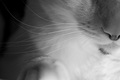
| 03/10/2008 06:52:45 PM |
Whiskersby MelethiaComment: It does not wow me any, but it is a nice and detailed shot of the cat's whiskers. One of those shots that is really pretty good, but just does not bowl me over or grab me. I'll say I would have probably sixed it, but in voting it could have gotten a five from me, not really sure.
Edited to add: I don't like to read others comments before I add my own, as I don't want them to influence what I say. I think Louis may have nailed it down better than I did. In a free study, you have a glut of "wow" shots that people have worked on all month, or saved their best for, and the subtle but good ones get lost in the crowd. Message edited by author 2008-03-10 18:55:56. |
| Photographer found comment helpful. |
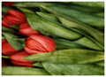
| 03/10/2008 06:45:56 PM |
Simply redby MelethiaComment: I haven't really gotten serious with layers yet, so a lot of your processing steps went over my head right now.
I really like what you did with it. Even though the tones are more subdued, it brought out the veins in the flowers. The composition may be a little too heavy on the left side, where all the red is. That's the only thing I might fault it with.
I did not vote on this one, but I think I would have given it a 6 or 7. Message edited by author 2008-03-10 18:46:26. |
| Photographer found comment helpful. |
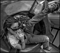
| 03/10/2008 01:51:57 PM |
The Rhythm of the roadby SoulMan1978Comment: I think this is a good effort at using tilt to try and add interest, but it falls a little short, I'm afraid. I also take pictures out my car window. Sometimes I get something interesting, more often not. Fun to try though. |
| Photographer found comment helpful. |
| 03/10/2008 01:49:46 PM |
Ten past Fiveby MAKComment: I like this, though I am not sure what she is in. Looks like a giant ashtray or something. Must be sculpture. I'd also like to know what the title is referring to. I assume it means it is just past the end of the workday. |
| Photographer found comment helpful. |
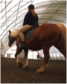
| 03/10/2008 01:47:01 PM |
Lesson Poniesby Donna21Comment: Not a lot of tilt here, and the perspective is a bit distorted. Otherwise, the quality of the shot itself is good. |
| Photographer found comment helpful. |
| 03/10/2008 01:41:23 PM |
|
| Photographer found comment helpful. |
Home -
Challenges -
Community -
League -
Photos -
Cameras -
Lenses -
Learn -
Help -
Terms of Use -
Privacy -
Top ^
DPChallenge, and website content and design, Copyright © 2001-2026 Challenging Technologies, LLC.
All digital photo copyrights belong to the photographers and may not be used without permission.
Current Server Time: 05/11/2026 02:36:23 PM EDT.