| Image |
Comment |
| 03/27/2008 01:58:43 PM |
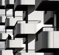
Aloneby silverscreenComment: The long focal length really did well for this scene. It does not lead my eye quite as well as it should though. Seems too heavy toward the bottom. Perhaps a different crop... |
 Photographer found comment helpful. Photographer found comment helpful. |
| 03/27/2008 01:54:55 PM |
Tubular Symphonyby MAKComment: Nice, though the white straw in the middle does not look natural. The middle is just too white and it looks like it was pasted there or enhanced in post processing. My apologies if I am wrong. |
| Photographer found comment helpful. |
| 03/27/2008 01:51:59 PM |
|
| Photographer found comment helpful. |
| 03/27/2008 01:49:58 PM |
Mast Highby BrianRComment: A bit of compression artifacts showing, especially toward the top of the frame around the masts. You file size is 99k, you could have used less compression and eliminated the artifacts. Always go with the maximum size you can use and still fit into the rules. That's 150k in this case. |
| Photographer found comment helpful. |
| 03/27/2008 01:46:50 PM |
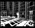
A Room with a Viewby SandyPComment: Nice. Fine lines and great detail. I may have done the comp so as to have it angled differently and off toward a corner a touch, but that a personal pref. |
| Photographer found comment helpful. |
| 03/27/2008 01:44:33 PM |
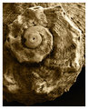
Whirlsby agrimaceComment: I really like this one. The sepia tone works well for the subject. Lots of nice texture here. |
| Photographer found comment helpful. |
| 03/27/2008 01:43:29 PM |
Row after rowby cogeroxComment: Very good. My only critique is that the point the comp is leading me toward is a little bit too much to the left for my preference. |
| Photographer found comment helpful. |
| 03/27/2008 01:41:33 PM |
Plaidby libertyComment: I'm not caring for the negative image, I'm afraid. It just comes off on me as harsh. |
| Photographer found comment helpful. |
| 03/27/2008 01:40:10 PM |
Sunriseby tamatamaComment: I missed the pattern when I was viewing the thumbnails. Now I see it is the ripples in the water that is the pattern here. Very nice. I like the composition. You got all the important elements in here with out centering it. I suspect you may get dinged a little because, though the pattern is there, it is not the main subject. That may be what is happening to my own entry as well. |
| Photographer found comment helpful. |
| 03/27/2008 01:36:00 PM |
Pattern of Changeby yantskiComment: Seems to have lost some of the fine detail of the coins in the resize to 640 pixels. I think in a large size this would have much more impact. |
Home -
Challenges -
Community -
League -
Photos -
Cameras -
Lenses -
Learn -
Help -
Terms of Use -
Privacy -
Top ^
DPChallenge, and website content and design, Copyright © 2001-2026 Challenging Technologies, LLC.
All digital photo copyrights belong to the photographers and may not be used without permission.
Current Server Time: 05/12/2026 08:30:22 AM EDT.