| Image |
Comment |
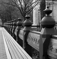
| 03/27/2008 09:53:11 PM |
Central Repetitionby tormentorComment: I like the pattern of the posts, but I find my eye being drawn to that light colored building in the background. Perhaps a different crop may have helped it flow differently. |
 Photographer found comment helpful. Photographer found comment helpful. |
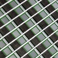
| 03/27/2008 09:51:22 PM |
Zig Zagby juliejoldComment: Good colors and detail. I think the right side needs a little skew correction. |
| 03/27/2008 09:50:06 PM |
|
| Photographer found comment helpful. |
| 03/27/2008 09:49:07 PM |
Basket Weaveby briandsdComment: Pretty good, though I think some different lighting and adjustments may have been able to bring out some more oomph in it. |
| Photographer found comment helpful. |
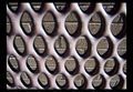
| 03/27/2008 09:45:59 PM |
Diagonal Viewby ThaiComment: I see a ton of what appears to be compression artifacts in this. Visible at all the high contrast edges. You file size is good, so I think this must have been highly compressed during editing, before it's final save. A good thing to do is if you need to save your work, save it either as a TIF, which has no compression, or in your editors native file format.
What is it? It could be a building, but it seems smaller than that. I think it may be a tray to hold microchips. |
| Photographer found comment helpful. |
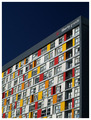
| 03/27/2008 09:39:33 PM |
Binary System by craigesterComment: Maybe a little higher in the frame would have flowed better for me, but that's minor. Nice and clear and bold. Looks like 60's or '70s architecture. |
| Photographer found comment helpful. |
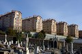
| 03/27/2008 09:37:34 PM |
Residence with viewby thierr26Comment: So is it the apartments that have a wonderful of the graveyard, or the dead folks with a wonderful view of the buildings?
Good exposure, colors, decent composition, but it's just not doing much for me, I'm afraid. |
| Photographer found comment helpful. |
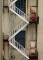
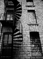
| 03/27/2008 08:56:43 PM |
Patterns In The Every Dayby bradshawComment: I like the detail and contrast of this. But I see two patterns here fighting for dominance as the subject, and the way the fire escape is slightly cut off at the edge is not working for me, either. I think you should have focused on either the fire escape or the blocked in windows. |
| Photographer found comment helpful. |
| 03/27/2008 08:53:38 PM |
|
| Photographer found comment helpful. |
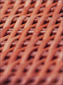
| 03/27/2008 08:50:51 PM |
Weaveby TrinchComment: DOF is reasonable and expected for such a close shot at an angle. The colors are a little dull, however. Some curves adjustments would really bring out the color and details. |
| Photographer found comment helpful. |
Home -
Challenges -
Community -
League -
Photos -
Cameras -
Lenses -
Learn -
Help -
Terms of Use -
Privacy -
Top ^
DPChallenge, and website content and design, Copyright © 2001-2026 Challenging Technologies, LLC.
All digital photo copyrights belong to the photographers and may not be used without permission.
Current Server Time: 05/12/2026 09:25:27 AM EDT.