| Image |
Comment |
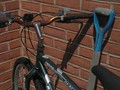
| 05/14/2008 08:35:38 PM |
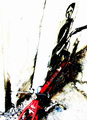
Stop!by TeeCeeJayComment: Pretty good, I like the comp and the red fork really pops out at me. I think the light resulted in some harsh shadows that do not show it all off well. |
 Photographer found comment helpful. Photographer found comment helpful. |
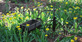
| 05/14/2008 08:34:07 PM |
The bike that time forgot.by DeniseComment: I'm finding the thin and dark subject does not really stand out from the busyness of the flower bed. A different angle on it may have helped it stand out a bit more, but I'm not totally sure exactly what to suggest. |
| Photographer found comment helpful. |
| 05/14/2008 08:29:55 PM |
Save the environmentby Kwilson10Comment: Good composition, my eye is drawn in just right from the lower left to the mid right. The details of the picture are not doing a lot for me however. It's just lacking some oomph somewhere. |
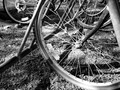
| 05/14/2008 08:27:39 PM |
Rustyby Kel27Comment: I'm afraid this seems like a snapshot, and it appears either a bit oversharpened, or the resizing method you chose resulted in too many jaggies. |
| 05/14/2008 08:25:51 PM |
|
| Photographer found comment helpful. |
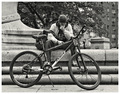
| 05/14/2008 08:25:07 PM |
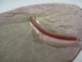
boy comforting his grainy,oversaturated&dying bikeby cutoutComment: Nothing some WD-40 can't fix.
Gotta give you some points here. I'm not sure if those point are for creativity or sheer chutzpah for entering this. I do like it, though I am not sure everyone will. It's got an interesting angle and texutres. Oh, yea, also that nice oversaturated red. |
| Photographer found comment helpful. |
| 05/14/2008 01:49:58 PM |
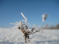
Lilyby bfurnerComment: This one has some real potential. The first thing I noticed is some graininess. It's noticveable, but not bad. A modest touch of noise reduction in software would fix that. Cropping about 15-20% off of the bottom would improve the composition and make the iced stem the focal point. A little adjustment with curves as well, and This ought to have a lot more pop to it.
I did a quick edit on this in PaintShop Pro.
[thumb]678744[/thumb]
I didn't do any noise reduction, as even a slight amount killed a lot of detail. If I'd had the original full res image, that may have worked better. The editing also brought out someother imperfections, but with the full size image available, you can do a better job. Editing steps are listed on the image notes. Message edited by author 2008-05-14 14:04:08. |
| Photographer found comment helpful. |
| 05/14/2008 01:43:48 PM |
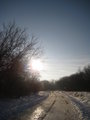
The Pathby bfurnerComment: Pretty decent composition on this. I see a little banding in the sky, but that is always difficult with a shot like this. Adjusting the colors a little with curves may give the texture of the snow and ice a little more oomph. In fact, the ground is where most of the interesting texture lies, I would suggest cropping or framing it to have more ground and less sky. Here's a similar sundown shot I did. As you can see, I also was unable to avoid the banding in the sky:
 |
| Photographer found comment helpful. |
| 05/14/2008 01:37:42 PM |
Snow Topped 1by bfurnerComment: Nice colors and detail, though I think the DOF is not quite deep enough to grab all of the main subject. Thats ostly a limit of your camera, but backing off just a bit might increase the DOF a little. The subject probably needs to be a touch higher in the frame as well. |
| Photographer found comment helpful. |
| 05/14/2008 12:38:46 AM |
Racerby FozComment: Seen a few better days here. A nicely composed view, though the bar is slightly clipped on the left edge. |
| Photographer found comment helpful. |
Home -
Challenges -
Community -
League -
Photos -
Cameras -
Lenses -
Learn -
Help -
Terms of Use -
Privacy -
Top ^
DPChallenge, and website content and design, Copyright © 2001-2026 Challenging Technologies, LLC.
All digital photo copyrights belong to the photographers and may not be used without permission.
Current Server Time: 05/13/2026 10:33:40 AM EDT.