| Image |
Comment |
| 11/05/2008 01:13:50 PM |
Caution, Childrenby jonfrommkComment: A simple idea that others have also entered variations of, but this one is well executed. Very clean, crisp and bold. Maybe a little too centered for me. |
 Photographer found comment helpful. Photographer found comment helpful. |
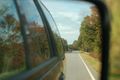
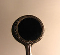
| 11/05/2008 01:05:58 PM |
Sunday Driveby bj0920Comment: I'm afraid this comes off as a casual snapshot in the mirror. I copied and pasted this into my editor to see if some simple adjustments could help. Tried levels, curves and a saturation bump, and it helped some, but not enough, I'm afraid. There's just not much in the frame to grab ones attention, I think. |
| Photographer found comment helpful. |
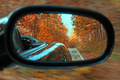
| 11/05/2008 01:01:43 PM |
Fall Behindby karenkComment: Nice fall colors. A good effort, though nothing really grabs me about it. |
| Photographer found comment helpful. |
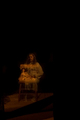
| 11/05/2008 01:00:24 PM |
Roseby danitelloComment: Interesting use of the theme. I wonder how hard it was to get her lined up like this, and if it is a person or a painting I am seeing? |
| 11/05/2008 12:58:56 PM |
A Reflect on Constructionby Gordon_1Comment: This could benefit from some levels, curves and saturation adjustments. Just out of curiosity, I copied and pasted this shot into PaintShop Pro and those quick adjustments made a huge difference in this pic. Those adjustments also brought out a lot of compression artifacts around the window frames. Your file size is only 49k. You could have used a lot less compression and that would have helped as well. Compression kills detail. Always use as much of the available file size as you can. (150k for a basic challenge)
Composition is a little odd as well. I can see some effort to try and get an interesting viewpoint, however. |
| Photographer found comment helpful. |
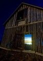
| 11/05/2008 12:49:36 PM |
The Sunset Withinby offiofComment: Nice concept and well done for the most part. Something about it made me check the file size, though. You could have probably used less compression and gotten a bit more detail into this. Your file size is 101k and you had 150k to play with. For a very detailed subject like this barn, you should utilize all the file size you can. |
| Photographer found comment helpful. |
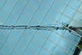
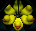
| 11/05/2008 12:44:58 PM |
Whats Up Duck?by DCrest01Comment: The secondary reflections (glass surface + underlying mirror layer) looks a bit odd at this angle, and I find the cropping a little too tight for my preference. |
| Photographer found comment helpful. |
| 11/05/2008 01:36:15 AM |
Black and Whiteby Nick96Comment: I'm afraid this one is going to be a brown contender. The lighting is pretty poor, there appears to be some blur from camera shake, and I think you used excessive compression on this. |
| 11/05/2008 01:33:55 AM |
|
| Photographer found comment helpful. |
| 11/05/2008 12:26:48 AM |
What?by freakin_hilariousComment: I'm not surprised at the score this got, but I salute you for a great abstract photo, and doing things a little differently. It's the kind of thing that does not appeal to the majority, unfortunately. I gave it an 8, BTW. |
| Photographer found comment helpful. |
Home -
Challenges -
Community -
League -
Photos -
Cameras -
Lenses -
Learn -
Help -
Terms of Use -
Privacy -
Top ^
DPChallenge, and website content and design, Copyright © 2001-2026 Challenging Technologies, LLC.
All digital photo copyrights belong to the photographers and may not be used without permission.
Current Server Time: 06/12/2026 03:01:38 PM EDT.