|
|
|
Showing 1111 - 1120 of ~1477 |
| Image |
Comment |
| 06/12/2008 10:30:25 PM | |  Photographer found comment helpful. Photographer found comment helpful. |
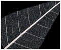
| 06/12/2008 10:23:39 PM | Skeletalby QikiComment: I am a total sucker for this kind of image! Did you "commit" to grayscale on this? I see three little brown elements (I spent a lot of time looking at this cuz I like it!), and now that I've seen them, I can't not see them any more (I can't not be bother with no good grammar, neither!). 8 | | Photographer found comment helpful. |
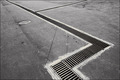
| 06/12/2008 10:21:12 PM | Hard nosedby olbolComment: Okay, this image just works for me, is my taste exactly (I have a similar sort of composition in my portfolio if you don't believe me). I like the way you see, the way you composed this--the arrangment of ALL of the Many Lines in this subject is well done. Totally an 8 | | Photographer found comment helpful. |
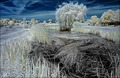
| 06/12/2008 10:19:12 PM | Chicken soupby sekarmalathyComment: so, the title makes absolutely no sense to me. but the image SINGS. Beautiful abstraction. The difficulty I always have with these sorts of images is choosing the crop--some elements are always severed, etc., and it is hard to find the right composition that brings some order out of the chaos. Obviously, this is not a problem you are afflicted with! Very well done. When the rules are no longer in the way, a subtle burn down of the bright elements in the lower right and upper left edge/corners might be worth a shot--keeping the brightest elements well within frame might be even better than this already is. 9 | | Photographer found comment helpful. |
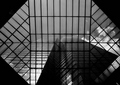
| 06/12/2008 10:14:34 PM | Oxfordby bvyComment: This is a spectacular composition--all the edges and corners are just right, and the placement of the tops of the skyscrapers is perfect. You have certainly accomplished "contrast" in this, as well. I think it might be possible to raise the values across the entire image, still have dynamic and interesting contrast, and a little more "snap" to the image, too. But being wrong is one of my 'strengths' and this is great just as is. 8 | | Photographer found comment helpful. |
| 06/12/2008 10:10:55 PM | The pierby GabrielComment: I like the subject, the composition, and the subtle soft texture in the overcast sky. On my monitor, which I think is in calibration, the underside of the pier goes pure deep untextured black over (in my opinion) a bit much of the pier. If the support column plunged into a fairly localized pitch black area, that would be cool, but most of the underside is formless. If it could be brought out just a bit, not much at all, I think this might be an even better image than it already is. 8 from me. | | Photographer found comment helpful. |
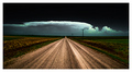
| 06/12/2008 10:02:01 PM | The chase is on!by Prime_TimeComment: I keep looking at this, and cannot decide about the negative space at the top. Now, I love me some good negative space, I surely do, but just can't quite decide: if you cropped down 10% would it be better or not? Would the cloud and road seem even more luminous, or less? Either way, see, you got me paying a lot of attention here! 8! | | Photographer found comment helpful. |
| 06/12/2008 09:59:41 PM | A Break in the Stormby JammurComment: seemingly simple, but just beautiful and well composed. The darker colors at the top of the image add a tension, and also convey the storm and the closeness of those clouds as compared with the distant ones. This image works on many level for me--but I love clouds, so there ya go. 9 | | Photographer found comment helpful. |
| 06/12/2008 09:57:09 PM | | | Photographer found comment helpful. |
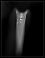
| 06/12/2008 09:56:21 PM | X~R A Yby sudhiComment: This is a lovely, surreal, semi-abstract image. I don't care for the title, as it tends to try and drive me to notice "hey, see, the blurry part looks kinda like an x-ray, cool, huh?" and I think this image is strong enough that I don't need any push to spend time looking at it, nor any nudge from the title to interpret it for myself. You know how sometimes you hear a song and you really like it, then later you see the associated music video and it is indelibly etched into your mind, forever alters your experience of that song? Well, I was lingering on this beautiful, delicate image, then I saw the title, and now mostly the x-ray aspect is all I see. Titles are hard, but I think less is more. 9 | | Photographer found comment helpful. |
|
Showing 1111 - 1120 of ~1477 |
Home -
Challenges -
Community -
League -
Photos -
Cameras -
Lenses -
Learn -
Help -
Terms of Use -
Privacy -
Top ^
DPChallenge, and website content and design, Copyright © 2001-2026 Challenging Technologies, LLC.
All digital photo copyrights belong to the photographers and may not be used without permission.
Current Server Time: 04/27/2026 08:24:20 PM EDT.
|