| Image |
Comment |
| 06/21/2002 03:40:00 PM |
The Thinker Revistedby rdesaiComment: This comes up kinda flat to me (yea, I know, "Well, duh, it's a shadow"), but it may have been more interesting with some different colors. Maybe? Like a pale blue wall, or a greenish tint to the whole thing. |
| 06/20/2002 12:22:00 AM |
La Florby GotchaComment: Great use of shadows. I think if the light on the flowers had been a little more bright, so that the red really showed, it would have been a little more effective. I like it as it is, though. Nice job. |
| 06/21/2002 02:09:00 PM |
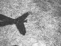
Flying Handsby bmacComment: This is a good idea, though I think the picture could have been improved by having the bird/hands enter the picture at a different angle. Maybe changing the position of the camera to get the bird flying in from the corner. That may have also eliminated teh the blurb of a shadow on the bottom. |
| 06/20/2002 12:05:00 AM |
LINKS by DigipixerComment: The red really makes this picture jump out and grab you! I really like it. It is focused really well and has nicely contrasting colors. |
| 06/21/2002 01:07:00 AM |
Endless Summerby AleciaComment: this is a really cool idea. I think if you could have gotten a color cast or tint in it (maybe orange) it would have been more dramatic. I like the three different textures beneath the shadow. |
| 06/23/2002 12:17:00 AM |
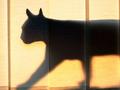
Hunterby DogmanComment: Even though I know shadows ARE flat, this picture would ave been better, I think, if there had been something to giv it some depth, like a plant in one corner or something. |
| 06/19/2002 03:53:00 PM |
Blue bird of paradiseby snsComment: Interesting interpretation of shadows. It is a really nice shade of blue. the intersecting corners kinda distracts me, but it was an interesting choice of subject matter. |
| 06/20/2002 12:09:00 AM |
Cotton Reelsby jhcrossComment: I like the way you have set this up. Did you try it with different colors of spools. I have found that if you include red in a picture, it seems to make it stand out more. This might also make a nice black and white shot. |
| 06/21/2002 05:47:00 PM |
wrong address...by MagsCoyoteComment: Just for the record, I saw the bee before you posted in the forums, I just hadn't gotten around to commenting yet. An no, it doesn't bother me that I "know" who took the picture, my comment will be the same. I found the picture to be hilarious, and figured that he was trying to get "in" the orange thing. However, the orange thing is so bright and the rest is so "natural' that the eye automatically goes to that side. As far as the bumblebee goes, those are hard little suckers to photograph! Good job. |
 Photographer found comment helpful. Photographer found comment helpful. |
| 06/23/2002 12:53:00 AM |
What Color Is YOUR Shadow?by GeneralEComment: I like the message this picture has, and I like the basic idea behind the set-up. The biggest problem I see with it is the hands and the shadow are too far apart, so you loose impact. also, having the hands at the edge of the planter doesn't seem to help. |
| Photographer found comment helpful. |
Home -
Challenges -
Community -
League -
Photos -
Cameras -
Lenses -
Learn -
Help -
Terms of Use -
Privacy -
Top ^
DPChallenge, and website content and design, Copyright © 2001-2026 Challenging Technologies, LLC.
All digital photo copyrights belong to the photographers and may not be used without permission.
Current Server Time: 06/21/2026 06:49:25 AM EDT.