| Image |
Comment |
| 01/30/2003 11:06:15 PM |
Vivid Symmetryby ChrisW123Comment: The contrast in this is nice, but it is lacking a something. Perhaps if you had placed something round on it to highlight the squares even more through contrast. Or placing something square on it. Either way would have help add some depth, I think. |
 Photographer found comment helpful. Photographer found comment helpful. |
| 01/30/2003 11:01:40 PM |
luckythrowby desmckechnieComment: I think you need either more blur showing definite motion, or less so that the picture is crystal clear. |
| Photographer found comment helpful. |
| 01/30/2003 10:56:39 PM |
Bird Houseby DianaComment: Beautiful scenary. Atfirst, I thought you might have needed to fill the frame more with the "bird condo" but I like the inclusion of the trees -- it adds context. Perhaps if it had been framed so that it was just the bird house and the tree immediately to the left of it, with the houses on the right third of the shot, it would have more dynamics about it. |
| Photographer found comment helpful. |
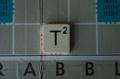
| 01/30/2003 10:55:06 PM |
T-Square(d)by RoseytoneComment: I think a little more light would have helped this shot not appear quite so "flat." Also, maybe if the tile wasn't centered quite so much. In the middle like that, it makes the picture very static, though stable. |
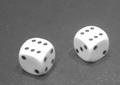
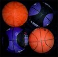
| 01/30/2003 10:54:03 PM |
basketballsby Wheeler1992Comment: A really sharp focus would have made these wonderfully contrasting colors really *pop* I think. |
| Photographer found comment helpful. |
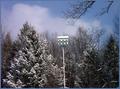
| 01/30/2003 10:53:35 PM |
Schaumburg Clock Towerby pitsamanComment: I am seeing some noise in the sky part of your picture, and I suspect that could cause the tower to look slightly out of focus. If you haven't used it, NEATIMAGE does a wonderful job with noise in a photo. |
| Photographer found comment helpful. |
| 01/30/2003 10:52:44 PM |
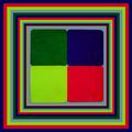
Borders Gone Mad :-)by marboComment: They are mad alright. That lightest green/yellow strip really begs for attention. I am interesting in knowing why you choose two shades of green. I think if the bottom one had been more yellow it would have been better. The frames pull you into the picture I think. |
| Photographer found comment helpful. |
| 01/30/2003 10:51:32 PM |
Crazy Quiltby basia03Comment: Those are gorgeous colors, but I can't tell if the fabric is just fuzzy, or if the picture is slightly out of focus or both. I think showing more giving more context to it would have made it more effective. |
| Photographer found comment helpful. |
| 01/30/2003 10:47:59 PM |
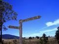
Sign in Blueby PtmanComment: CRITIQUE CLUB CRITIQUE
by karmat
COMPOSITION
The composition of this is very strong. The focal point of the picture, the sign, is nicely located on the left side of the frame and points into the picture. This gives a balanced, roomy feeling, and the viewer doesn't feel like they are going to follow the sign and run out of frame. The large tree on the left provides a nice contrast to the more open side on the right. The angle of the sign matches the angle of the clouds nicely as well. If I had to suggest anything to improve this, it might to crop just a hair off of the right side because there are a few stray branch tips about half way down.
TECHNIQUE
The colors in this shot are wonderful. The deep blue provides a nice backdrop for the white sign, and the greens really fill the bottom of the frame nicely. It seems to be a touch oversharp because the ends of the branches *pop* a little more than looks natural. I also see some noise in the sky, but that may be my monitor as it is not real obvious.
OVERALL EFFECT
The sign is technically very well done. Very little can be said to improve it. I can also see this one being a nice "postcard" or wall hanging for a local inn or restaurant. It doesn't seem to be a sign that makes a strong emotional statement, but that is recognizably not the purpose for all signs. I think though, if you could have added something the shot, or had something else in it that would have helped give a "story" to it, it would have scored even higher.
Overall, a great picture, and ver well done.
karmat
|
| Photographer found comment helpful. |
| 01/30/2003 10:20:49 PM |
Highway 314by vjozComment: CRITIQUE CLUB CRITIQUE
by karmat
COMPOSITION
The composition of this is very good. Everything works together to draw the eyes from the left side of the frame up and into it. The position of the sign, and the road on the right really make the shot feel balanced to me. The lights also add the the complete/balanced feeling by running counter to the sign and road.
TECHNIQUE
In my opinion, I think the exposure may have been a touch long on this. Though it produces excellent focus, the lights and some of the spots on the snow are almost blown out, detracting from the rest of the picture. Having said that, it does give a certain effect, which I will discuss in a moment. The crop works very well as it allows just the subject to show, without a lot of extraneous "stuff" being involved.
OVERALL EFFECT
Though technically the brighter spots are blown out, it adds a certain atmosphere to the picture,so it may be more effective than not. It gives a certain "rushed" or urgent feeling, though there is clearly none, or very little traffic. the high contrast makes it is an edgy picture, meaning that it is not peaceful or relaxing, so if that was the look you were going for, you did well. Well done, and I look forward to seeing more of your work.
|
| Photographer found comment helpful. |
Home -
Challenges -
Community -
League -
Photos -
Cameras -
Lenses -
Learn -
Help -
Terms of Use -
Privacy -
Top ^
DPChallenge, and website content and design, Copyright © 2001-2026 Challenging Technologies, LLC.
All digital photo copyrights belong to the photographers and may not be used without permission.
Current Server Time: 07/18/2026 08:43:59 AM EDT.