|
|
|
Showing 7111 - 7120 of ~9205 |
| Image |
Comment |
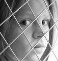
| 01/30/2003 11:28:51 PM | Looking Throughby PaigeComment: The emotion showing on her face really makes an impact behind the "squares'. Excellent shot, and good use of bw. |  Photographer found comment helpful. Photographer found comment helpful. |
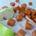
| 01/30/2003 11:27:50 PM | Carmel Squaredby MajorChaosComment: Great focus, and use of depth of fiels. I love the dramatic angle, and the soft, though bright, colors. Wonderful. Hope you made enough for all of us!!!! | | Photographer found comment helpful. |
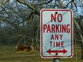
| 01/30/2003 11:24:47 PM | No Parking Any Time except for COWSby dadas115Comment: CRITIQUE CLUB CRITIQUE
by karmat
COMPOSITION
The compositiof of this is very strong. The sign is located in such a way as to anchor that side of the frame, and provide a nice resting place for the eyes. The subject matter is also a good choice, as it, along with your title, adds a nice humorous effect, I think.
TECHNIQUE
I think if the sign, which is the subject of the picture, were more in focus, adn the cows were less, it would be more effective. Since it was a signs challenge, that was the first thing people would look at. Since it was just slightly out of focus, people may not have studied the rest of the shot enough to see that the cows, etc. are focused very well. the limbs in front of the sign do seem a bit distracting, but after reading your comment, I can understand why you left them. One way to have gotten that across was through the title, or if you could have found some more limbs to drape across it, it may have been more obvious.
OVERALL EFFECT
Overall, I like the application of humor and the fact that it was a sign, so it fit the challenge, but it was also interesting, because there was a story there, not just a sign. Good work, and good luck in the future challenges.
|
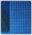
| 01/30/2003 11:17:04 PM | ArchiSquaresby Dallas_TXComment: Awesome focus and colors. I think if the frame were moved a little more to the left, so that there wasn't such a vast expanse on the right, it would have even more interest to it. | | Photographer found comment helpful. |
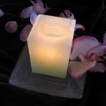
| 01/30/2003 11:16:16 PM | A candle and an orchidby shohnComment: Very peaceful looking, adn pleasant. I think the composition could have been made stronger if you had cropped part of the bottom of the candle holder and allowed more room at top. It just feels crowded up there to me. | | Photographer found comment helpful. |
| 01/30/2003 11:15:12 PM | | | Photographer found comment helpful. |
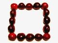
| 01/30/2003 11:14:40 PM | Cherriesby rj324Comment: Having the four corner cheeries slighly brighter than the rest works well I think. For me though, I would have liked to see it with them all very bright and vivid, adn not quite so contrasty. | | Photographer found comment helpful. |
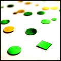
| 01/30/2003 11:09:10 PM | Plastic Rainbowby jgillardComment: Good use of colors. The composition seems a little off to me. I think it either needs to be centered more, or more in the right of the frame so that soem of the cases are "hanging" off. |
| 01/30/2003 11:08:24 PM | Rolling the Diceby DJLubaComment: The contrast between the red and green works well. I think it may be just a tad dark though. Those colors, with a little more light, could be awesomely vivid, I think. |
| 01/30/2003 11:07:31 PM | Subtle Squareby BJComment: I think some more contrast would ahve helped this picture be a bit more attention grabbing. All of the colors are so similar and muted it seems kinda flat. | | Photographer found comment helpful. |
|
Showing 7111 - 7120 of ~9205 |
Home -
Challenges -
Community -
League -
Photos -
Cameras -
Lenses -
Learn -
Help -
Terms of Use -
Privacy -
Top ^
DPChallenge, and website content and design, Copyright © 2001-2026 Challenging Technologies, LLC.
All digital photo copyrights belong to the photographers and may not be used without permission.
Current Server Time: 07/18/2026 01:49:22 AM EDT.
|