| Image |
Comment |
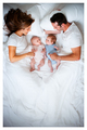
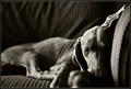
| 01/21/2009 03:44:24 PM |
Not For Lack of Loveby shamerComment: Just when I about kick the whole "i wanna another baby" thing, along comes a picture like this. thanks a lot! :) |
 Photographer found comment helpful. Photographer found comment helpful. |
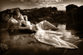
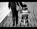
| 01/19/2009 02:04:12 PM |
No Matter Where We Areby JudiComment: I don't know if it is my imagination or what, but it feels ever so slightly tilted to the left. |
| Photographer found comment helpful. |
| 01/16/2009 12:49:41 PM |
|
| Photographer found comment helpful. |
| 01/15/2009 12:37:46 AM |
|
| Photographer found comment helpful. |
| 01/15/2009 12:37:25 AM |
Human Comfortby bspurgeonComment: The cute factor is high, BUT the technicals on this shot are simply outstanding. GREAT shot. |
| Photographer found comment helpful. |
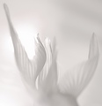
| 01/15/2009 12:36:55 AM |
dormancy by undieyatchComment: I like the *motion* from one side of the frame to the other that the sweeping shadows make. |
| 01/15/2009 12:36:18 AM |
|
| Photographer found comment helpful. |
| 01/15/2009 12:35:28 AM |
|
| Photographer found comment helpful. |
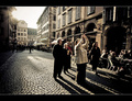
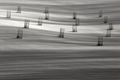
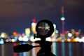
| 01/13/2009 03:22:13 PM |
Toronto through Six Elementsby Shutter-For-HireComment: CRITIQUE CLUB CRITIQUE
by karmat
This is a very interesting photo.
Compositionally, I think it could have been made a touch stronger by cropping it a bit differently. If the lens weren't quite so centered, it might feel more dynamic. For example, had you cropped some off of the right of the picture, that would have put the tripod further left and out of the center. (It would have also eliminated those two little dark spots that might be sensor dust or something). Another benefit would be that the part that is sharpest and in focus would become a more predominant part of the picture.
Technically, the exposure and colors rock. The focus on the glass is good, but the tripod is a bit out/soft and that takes just a tiny bit away from it, I think.
Overall, a good shot, and a good one for this challenge.
Karma |
| Photographer found comment helpful. |
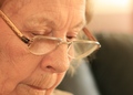
| 01/13/2009 11:11:37 AM |
Readingby LuckyShotComment: CRITIQUE CLUB CRITIQUE
by karmat
Compositionally, this shot is done well, I think. It is fairly balanced between the face and background, but may need just a smidgen more at the bottom -- maybe include more of the chin.
Technically, the first thing that strikes me is that it is out of focus. However, upon second glance, I can see that the glasses do indeed seem focused. However, since the face takes up more of the frame, and is the primary "focus" (no pun intended), the overall impression that one takes away from the shot is that it is soft.
More than that, though, her face color is very similar to to the background color in the upper third. This gives a very subtle impression of a lack of contrast. I'm wondering if a bw conversion would have helped this, or if having more contrast in the color version could have minimized it.
Overall a shot to be treasured for years. Nice work.
Karma |
| Photographer found comment helpful. |
Home -
Challenges -
Community -
League -
Photos -
Cameras -
Lenses -
Learn -
Help -
Terms of Use -
Privacy -
Top ^
DPChallenge, and website content and design, Copyright © 2001-2026 Challenging Technologies, LLC.
All digital photo copyrights belong to the photographers and may not be used without permission.
Current Server Time: 06/20/2026 01:35:42 PM EDT.