| Image |
Comment |
| 03/30/2003 11:43:34 PM |
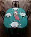
Easter (dinner) timeby drydocComment: Great idea!! Took me a minute to see exactly what you had done here. The 3 and 9 are difficult to because of the way the light is reflecting off of them. |
| 03/30/2003 11:42:52 PM |
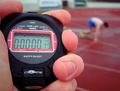
From the Startby bjovikComment: Awesome work. I wanted to do this set up, but had none of the necessary elements except the stop watch! The fingers look a little pink. Maybe a bit of desaturation in the red (though you will lose some of the track's brilliance), or convert it to bw. |
| 03/30/2003 11:41:41 PM |
|
| 03/30/2003 11:41:12 PM |
Timelessby DougPazComment: I love the blue sky, and the details you have captured in the building. My only comment would be to crop it a little closer on the left since it is "tight" on the right. It feels a little off balanced to me. |
| 03/30/2003 11:40:09 PM |
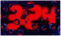
3:24by rj324Comment: Beautiful colors and clarity! |
 Photographer found comment helpful. Photographer found comment helpful. |
| 03/30/2003 11:39:26 PM |
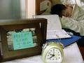
Late!by starblazerComment: Great idea and wonderful execution. I don't know how much effort it took to set this up, but it flows nicely, and doesn't look too cluttered! I can also relate to this, because this was the stuff of nightmares when I was in college! |
| Photographer found comment helpful. |
| 03/30/2003 11:36:39 PM |
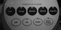
Real Powerby mliborioComment: CRITIQUE CLUB CRITIQUE
by karmat
COMPOSITION
I think the composition of this could have been made much more interesting by possibly placing it on a solid background, and getting at a very low angle and taking the picture so that the "controls" as well as the main part of the blender was showing. Or, if you had gotten on one end of the "controls" or the other. Being straight on kinda makes it static and flat.
TECHNIQUE
The black and white works well, and though some commented about the darkness, it looks fine on my monitor. The focus is good.
OVERALL EFFECT
I think the lack of perspective or context makes this shot less interesting than it could be. It is a good idea, just needs a little more tweaking to be truly effective, I believe.
Best to you in the future challenges.
|
| 03/30/2003 11:31:51 PM |
|
| 03/30/2003 11:31:33 PM |
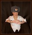
I love these Russian parties!by AnastasiaComment: I can't tell if she has on dark pants, or if she is sitting under part of the backdrop. Great lighting and capture of her expression, though. |
| Photographer found comment helpful. |
| 03/30/2003 11:30:06 PM |
Repentant Heartby sunflowerComment: A great idea, but I think a solid tee shirt would have helped focus the attention a little better. Also, a lower angle so that it is clear what is being looked at. At first, I thought it was somekind of anchor or something! |
Home -
Challenges -
Community -
League -
Photos -
Cameras -
Lenses -
Learn -
Help -
Terms of Use -
Privacy -
Top ^
DPChallenge, and website content and design, Copyright © 2001-2026 Challenging Technologies, LLC.
All digital photo copyrights belong to the photographers and may not be used without permission.
Current Server Time: 07/18/2026 04:05:05 PM EDT.