| Image |
Comment |
| 04/16/2003 06:55:43 PM |
|
 Photographer found comment helpful. Photographer found comment helpful. |
| 04/16/2003 06:52:55 PM |
Quarterby AnnidaComment: CRITIQUE CLUB CRITIQUE
by karmat
You have done well at meeting the challenge in a creative and colorful ways. The colors are bold and daring, and capture the viewer's attention immediately. The composition adds interest by only having part of the red section showing, and then the lines at the bottom help to draw the eyes downward. The colors, as mentioned previously, are very dramatic, I think, and do well to add to the photograph.
I can't comment on focus and lighting, because I have no idea what I am looking at! :-) As an abstract, I believe it is done well. As far as DPC is concerned, I guess a slightly more contextual view to appeal to the more general viewer would have helped. Otherwise, if you are happy with, go for it.
Best to you in future challenges.
|
| Photographer found comment helpful. |
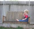
| 04/16/2003 06:47:08 PM |
Afternoon Snackby tcherringComment: Great capture. I am sure he hated posing for this one! haha. Two things, the straight on angle makes the shot appear flat, though it is a good way to get a profile. I think a lower, more frontal angle showing more of his face would have been effective. It might have also correct the slight tilt the picture seems to have. The second thing is that the colors are a bit flat. Maybe a touch of saturation or brightness/contrast would help. Good work. |
| Photographer found comment helpful. |
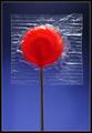
| 04/16/2003 06:45:29 PM |
Lolly Stopby magnetic9999Comment: Great colors, focus, and lighting. The red really contrasts nicely with the blue background. I am sure you have a reason for leaving the wrapper on, but I think it would have made a better picture without it. |
| Photographer found comment helpful. |
| 04/16/2003 06:44:44 PM |
Pick Your Colorby RefocusedComment: The entire picture seems a little grainy to me, but great colors and set up. I like how they "scatter" at the bottom of the frame. |
| Photographer found comment helpful. |
| 04/16/2003 06:44:00 PM |
A hint of mint by marboComment: I love the white on white, but it does seem to need something to give it a little more *pop*. Maybe a touch more contrast? |
| Photographer found comment helpful. |
| 04/16/2003 06:43:28 PM |
|
| Photographer found comment helpful. |
| 04/16/2003 06:43:05 PM |
Tic-tacby pitsamanComment: The focus and lighting works well here, but after looking at it on three different monitors, the orange tictacs look almost like the cinnamon ones. I would almost bet that you have a Sony camera, because both of my Sony's do the same thing(reds and oranges are crazy sometimes). Maybe the green ones would have done better. having said all that, the composition is right on, and I really like this shot. |
| Photographer found comment helpful. |
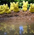
| 04/16/2003 06:41:11 PM |
Easter Islandby BudweezerComment: The reflection really adds to this!!!! Great work -- focus and lighting are awesome. Well done |
| Photographer found comment helpful. |
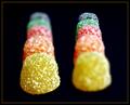
| 04/16/2003 06:40:41 PM |
Chewy Swirlsby SonifoComment: I like the richeness of the colors. Also, the angle that you have shot it with, and your composition is also very good. Just a note, and it has nothing to do with your score, but the border seems a bit wide and intrusive to me. |
| Photographer found comment helpful. |
Home -
Challenges -
Community -
League -
Photos -
Cameras -
Lenses -
Learn -
Help -
Terms of Use -
Privacy -
Top ^
DPChallenge, and website content and design, Copyright © 2001-2026 Challenging Technologies, LLC.
All digital photo copyrights belong to the photographers and may not be used without permission.
Current Server Time: 07/19/2026 06:08:53 AM EDT.