| Image |
Comment |
| 05/21/2003 12:26:26 AM |
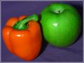
Still Lifeby rickhd13Comment: The pepper alone would have made a nice shot as well, though the green of the stem and the green of the apple ties the shot together well. |
| 05/21/2003 12:20:45 AM |
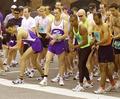
The Raceby RefocusedComment: Cropping to show just their feet might have been interesting as well. On a side note, it is hilarious how most of them are concentrating on their watches (I know why, but it is still funny looking). |
 Photographer found comment helpful. Photographer found comment helpful. |
| 05/21/2003 12:18:50 AM |
|
| Photographer found comment helpful. |
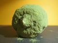
| 05/21/2003 12:17:38 AM |
Nuts to Butternutby jaamComment: Great detail, though I don't find the subject particularly appealing. You have done well at capturing this. I like your application of the shallow depth of field. |
| Photographer found comment helpful. |
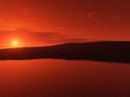
| 05/21/2003 12:08:44 AM |
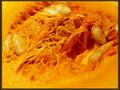
Orange water... Orange skyby YppieComment: I really like how the land is breaking the two "oranges" up. It seems a little "blocky" going down the horizon on the right I'm not sure it is a compression or focus issue, because i have had shots do that on diagonal lines when the shot was full size and well focused. If you figure out what causes it, let me know!! |
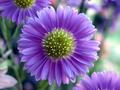
| 05/20/2003 11:58:41 PM |
Purple Explosionby pirelandComment: I like the subtle composition of the flowers in the background. They balance the main subject nicely. |
| Photographer found comment helpful. |
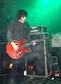
| 05/20/2003 10:05:36 PM |
B.R.M.C.by KIKIComment: This is a good band shot. It is grainy, so I assume you were using a higher ISO. Though the green is very obvious, the thing that catches my attention and focus is the bass. And though it looks orangy, it seems more red to me. Not a huge deal, though. 6 |
| Photographer found comment helpful. |
| 05/20/2003 01:15:22 PM |
|
| Photographer found comment helpful. |
| 05/19/2003 11:28:05 PM |
Flower of Secondary Colorby kaysrivComment: I like the framing/composition of this -- it almost "teases" the viewer. Also, theat is a fantastic shade of orange! |
| 05/19/2003 11:03:18 PM |
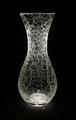
Shatteredby LustreComment: CRITIQUE CLUB CRITIQUE
by karmat
I think you have done an excellent job of lighting this. It really illuminates the "cracks" well, and I like how the skinny part of the neck is brighter than the others. The simplicity of the colors (bw?) are effective in making the eyes focus on the patterns in the glass. The curves of the vase are also very graceful.
I think something that would have added more drama to this shot would be to compose/frame it differently. As it is, the centered location and basically straight on shooting makes the shot a stable one, but it kinda makes the viewer look at it and say, "okay, anything else?" I find my eye wanting somewhere to rest. Maybe if you could have moved in closer and filled the frame up with the vase, even to the point of some of it "spilling" out of the frame, it would have added more interest. Perhaps you could have chosen a perspective that would have really accented the graceful curves.
If you have any questions or comments, please feel free to PM me. best to you in future challenges.
karmat |
| Photographer found comment helpful. |
Home -
Challenges -
Community -
League -
Photos -
Cameras -
Lenses -
Learn -
Help -
Terms of Use -
Privacy -
Top ^
DPChallenge, and website content and design, Copyright © 2001-2026 Challenging Technologies, LLC.
All digital photo copyrights belong to the photographers and may not be used without permission.
Current Server Time: 07/21/2026 02:43:51 PM EDT.