|
|
|
Showing 6641 - 6650 of ~9205 |
| Image |
Comment |
| 05/25/2003 09:00:35 PM | Hemlock Gorgeby salparadiComment: The more I look at this one, the more I like it. Very nice texture, and though I would like to see more blue in the upper left, it balances nicely with the white in the lower right. |  Photographer found comment helpful. Photographer found comment helpful. |
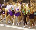
| 05/25/2003 06:06:20 PM | The Raceby RefocusedComment: CRITIQUE CLUB CRITIQUE
by karmat
I have commented previously, though ever so briefly, about my first impression of the picture, so I will try to be a little more specific this time! :-)
I think your focus is right on, and you used the availble lighting well. The overall composition may be a bit busy, though, with so many runners to look it. It does have a good photojournalist/sports photography look to it though. As far as "meeting the challenge," I think your entry could have been strengthened by focusing on the three guys in front and on the right. Since one has an orange jersey, then a yellow one, then a blue/purple one, it may have "highlighted" the colors more, and made them more of a focal point in the picture.
After reading your comments, I see that several stated it had a "snapshot" feeling to it. I imagine the busy composition I mentioned above may lead to that. You have included a lot of "stuff" for the viewer to look at. Also, on either edge are partial people. Especially on the right, where half of the tall guy is cut off. Perhaps if you could have zoomed in/cropped one person, or even two or three, to allow more of a focal point, it wouldn't feel quite so casual. I think a neat picture would have been a super close up of one of the faces (challenge notwithstanding), to really show the intensity.
Hope this helps. If you have questions or comments, please feel free to PM me. Best to you in future challenges.
karmat
|
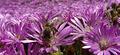
| 05/25/2003 05:54:03 PM | Pollinatorby simkinComment: CRITIQUE CLUB CRITIQUE
by karmat
Nice picture, and it does meet the challenge, I think with the purple petals and the yellow centers. The bee also helps to add to the yellow part, I think.
I really like the crop on this. It feels the frame with a predominant background color, and forces the eye to the bee. there is not a lot of room to wander around in. Also, for the most part, I like the depth of field that you have chosen to use. Looking at your information and everything, the bee could have been in focus if it were backwards just a touch. It would appear that the camera was focusing on the flowers instead. What I have found useful with my 707 is to turn the display on until I have the little square box (or corners of it) in the center of the screen. I put my main subject in it, press the shutter half way down to lock exposure, etc. then reframe and shoot. Sometimes it works better than others, but by doing this, I am more able to control where the focused part is. You may know this, and if so, sorry, didn't mean to tell you something you didn't already know.
It appears a bit edgy, almost like it wasn't quite right from the camera and you applied some post processing to it. Maybe brightness/contrast/saturation/sharpening, etc., or a combination. Or it may be a bright sun light. I'm really not sure. While it serves to make the front flowers *pop* from the back ones, it gives it an almost grainy look. some may like it like that.
If you have any questions or comments, please feel free to PM me. Best to you in future challenges.
karmat |
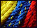
| 05/23/2003 04:32:21 PM | Primary Ropeby KazComment: CRITIQUE CLUB CRITIQUE
by karmat
This is one of pictures from the challenge that I like as soon as I saw it, adn just sat and looked at it for a while. I really like the bright, vivid colors, and I think the diagonal motion throughout the shot makes it especially dynamic. From any point on the bottom or left, the eyes are drawn upwards and to the right. Likewise, they can be drawn down and left as well. The focus is great, as each of the "threads" are visible and the entire picture is very clear. The lighting is good, because there are not exceptionally strong bright spots, or washed out areas to distract the viewer.
The only minor thing I could think of to "improve" it would be to find a yellow rope with another color in it, or to put the yellow one in the middle. I think it might seem a little more balanced that way.
Great work, though adn best to you in future challenges.
karmat | | Photographer found comment helpful. |
| 05/22/2003 11:38:43 PM | |
| 05/22/2003 11:36:59 PM | | | Photographer found comment helpful. |
| 05/22/2003 11:32:49 PM | | | Photographer found comment helpful. |
| 05/22/2003 05:35:51 PM | Mowby rickhd13Comment: I think the tire detracts from the overall composition, but I like the green grass. Good colors. | | Photographer found comment helpful. |
| 05/22/2003 05:34:37 PM | Complimentary Jacks Awayby RLSComment: Took me a second there! I was like how did he get all of them to "stick" together. hahaha. Great work on getting all of it equally focused. | | Photographer found comment helpful. |
| 05/22/2003 05:32:33 PM | Spooning Candiesby BigSmilesComment: This picture made my son (16 months) go, "Oh, mmmmmm." Good response. Wish the focus had been a little sharper on the blue one. | | Photographer found comment helpful. |
|
Showing 6641 - 6650 of ~9205 |
Home -
Challenges -
Community -
League -
Photos -
Cameras -
Lenses -
Learn -
Help -
Terms of Use -
Privacy -
Top ^
DPChallenge, and website content and design, Copyright © 2001-2026 Challenging Technologies, LLC.
All digital photo copyrights belong to the photographers and may not be used without permission.
Current Server Time: 07/21/2026 06:40:17 PM EDT.
|