| Image |
Comment |
| 09/05/2003 12:50:20 AM |
|
 Photographer found comment helpful. Photographer found comment helpful. |
| 09/05/2003 12:46:38 AM |
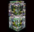
Beads and More Beadsby Silent SisterComment: The lighting is interesting, though it sets up a bit more contrast than I personally like or think is effective. The biggest "gripe" (mind you it is only my opinion) is that the picture seems off kilter to me. Maybe it needs to be rotated a touch clockwise to even it, or ccw to make it obviously off line. |
| Photographer found comment helpful. |
| 09/05/2003 12:44:40 AM |
|
| Photographer found comment helpful. |
| 09/05/2003 12:43:42 AM |
|
| 09/05/2003 12:34:42 AM |
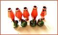
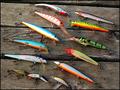
Hooked Up!by RuchartComment: Interesting take on the theme, and good colors. I think a lower, more dramatic angle would have really given this some depth. |
| Photographer found comment helpful. |
| 09/05/2003 12:31:47 AM |
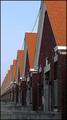
Horse Barnsby rickhd13Comment: Great capture. What would it look like flipped horizontally so that the eyes were drawn left to right instead of right to left? |
| Photographer found comment helpful. |
| 09/05/2003 12:30:14 AM |
|
| 09/05/2003 12:29:32 AM |
4 wine glassesby birgirComment: Good idea, but the lighting makes it seem a bit flat to me. I'm not sure, it just lacks some visual "punch." |
| Photographer found comment helpful. |
| 09/05/2003 12:28:20 AM |
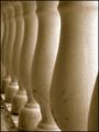
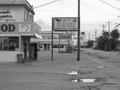
The rhythm of my homeby johnmkComment: You have good repeating elements, and I like how the yellow stands out from the rest; it adds interest, I think. The overall quality of the shot seems a little grainy though. Perhaps a larger fstop number would help? |
| Photographer found comment helpful. |
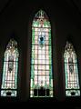
| 08/30/2003 11:03:01 AM |
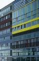
Church Windowsby mcrochipComment: CRITIQUE CLUB CRITIQUE
by karmat
Overall, I think this is a good picture, and that you have used negative space to emphasize your subject. I do feel the framing/cropping is a bit tight, and as a result, feels off balanced. More space on either side, and more on top would have really made the NS seem dramatic, I think. The exposure seems to work well, as the colors are vivid without being blown out, and the focus seems okay. The details of the window are crystal clear, but I suspect that is a distance thing rather than a focus thing. The only thing that really bothers me about this shot is that even though it is straight (as can be evidenced by the bottom of the center window), it stills feels loopy to me. Some of it is probably distortion caused by shots like this, but it just feels like you need to move a few inches to your right when this was shot. I saw the comment about existing artwork, and though I many not agree with it, it may have been interesting to put someone or something in front of the window to create a silhouette. Someone praying or something. Of course, I don't know the logistics, but if it had been possible, it would have added a definite focal point to the shot.
Best to you in future challenges
karmat |
| Photographer found comment helpful. |
Home -
Challenges -
Community -
League -
Photos -
Cameras -
Lenses -
Learn -
Help -
Terms of Use -
Privacy -
Top ^
DPChallenge, and website content and design, Copyright © 2001-2026 Challenging Technologies, LLC.
All digital photo copyrights belong to the photographers and may not be used without permission.
Current Server Time: 07/24/2026 04:59:50 AM EDT.