| Image |
Comment |
| 02/07/2004 01:15:51 PM |
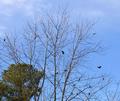
Birds and treesby neenee1999Comment: Being able to see more of the birds would have made this even more effective, I think, though I understand the difficulty in doing that. I like the green tree in the lower left, for some reason. Adds stability to the shot, I thinkl |
 Photographer found comment helpful. Photographer found comment helpful. |
| 02/07/2004 01:14:33 PM |
|
| Photographer found comment helpful. |
| 02/07/2004 01:13:48 PM |
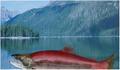
Monster at Red Fish Lakeby falveyComment: The color contrast between the fish and mountains is nice. however, it lacks depth, and the focus on the fish could be a little stronger I think. that would make the softness of the background look more deliberate and effective. |
| 02/07/2004 01:10:12 PM |
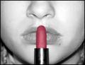
LipsStickby kncoughlinComment: I like the composition, but in the desaturation, the lipstick looks rather flat and one dimensional, I think. |
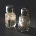
| 02/07/2004 01:09:28 PM |
"Salt and Pepper" Shakers!by tolovemoonComment: Good color contrast. I think a lower, closer perspective would work with shot, so that you didn't have quite so much background showing. |
| Photographer found comment helpful. |
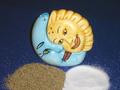
| 02/07/2004 01:08:27 PM |
Chips and Dip: A Square Meal?by GeneralEComment: I like how you have "framed" the shot with the tile. It is a good idea, but colorwise is kinda bland to me. Maybe if you had some of those blue chips, or had the dip in different color bowl, it would have a little more spark to it, for me. |
| Photographer found comment helpful. |
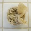
| 02/07/2004 01:07:23 PM |
Paper-Scissors-Stoneby Geo_GriffinComment: I started to do a shot very similar to this, but was too lazy to go outside and get a rock. hahah
Photographically, I think your shot comes up a little short because it is so "flat." A lower perspective and filling the frame more with the rock and scissors would have really helped, I think. Wrinkling the paper adds interest and texture to it, but it is composed in such a way to look "static." I find my eyes pulled to the outside black border, away from the subject.
This shot has a lot of potential, I think. Perhaps composing it so that the scissors are closer to the rock, the paper provides the entire background, and the whole thing is more vertical than horizontal would ahve really made it pop. Of course, it is just my opinion, so ymmv. Good luck. |
| Photographer found comment helpful. |
| 02/07/2004 01:03:45 PM |
PAIR . Deliveranceby undieyatchComment: I know I am probably missing something here, but I honestly don't get it. Photographically speaking, the different bands of color are interesting, and the focus is good, but overall it is kinda flat. Maybe more context would help (at least for me). |
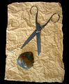
| 02/05/2004 05:48:32 PM |
salt and pepperby slonkoComment: The light on the salt shaker is such that it looks almost as much like pepper as the pepper does. A couple of suggestions -- get closer to your subject and lower your perspective. That would help to fill the frame more and add to the interest of the shot. |
| Photographer found comment helpful. |
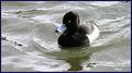
| 02/05/2004 05:43:08 PM |
Duck & Water...by MikeOComment: A lot of details seems to be lost in the duck -- its eye is very noticeable, almost to the point of being distracting. Did you use a polarizer? I think, if not, it might help cut down on the glare of the water, adn give it a little more color "tone" |
| Photographer found comment helpful. |
Home -
Challenges -
Community -
League -
Photos -
Cameras -
Lenses -
Learn -
Help -
Terms of Use -
Privacy -
Top ^
DPChallenge, and website content and design, Copyright © 2001-2026 Challenging Technologies, LLC.
All digital photo copyrights belong to the photographers and may not be used without permission.
Current Server Time: 07/24/2026 06:40:05 AM EDT.