|
|
|
Showing 6061 - 6070 of ~9205 |
| Image |
Comment |
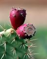
| 01/23/2005 11:01:29 PM | cactus.jpgby robdocComment: CRITIQUE CLUB CRITIQUE
by karmat
Overall, I like the colors in this photo. The pinkish/purplish/red really contrasts nicely with the green. Also, your composition is very strong by having most of the cactus out of the frame, but having it "sit" in the bottom left. This positioning gives a feeling of strength and stability. I was going to comment that I felt a stronger, clearer focus would have helped the shot. But, I see below that you actually have a couple of comments about the good focus, so that is obviously just me, I guess. In my opinion, having the whole cactus in razor sharp focus (no pun) would help increase the contrast with the not focused background. The only other aesthetic thing I would change is the color of the background. It is kinda "dull" (in tone or mood, not interest level), and I think a brighter color would help it stand out more.
As far as the challenge goes, to me, this is almost just shallow depth of field. More of a pattern of color(s) in the background would have helped address this, I think. Perhaps if you had a couple other of these plants in the background, or something like that.
Overall, a fairly solid shot.
Good work and the best to you in future challenges.
karmat |
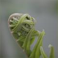
| 01/19/2005 05:38:05 PM | Holding on to lifeby mattrixComment: CRITIQUE CLUB CRITIQUE
by karmat
In general, challenge criteria notwithstanding, this is an awesome shot. you have captured the detail in an amazing way, and it is neat to just sit and look at the picture. Compositionally, it works well. It fills the frame and has a strong diagonal. Part of me wants to see it mirrored horizontally, though, so that the eye goes from the bottom left to the upper right, which seems a bit more natural (in Western culture anyway), than upper left going down. I also think, outside of this challenge (more on that later), a different color background that would compliment the green and really make it *pop* would be interesting.
For this challenge, my understanding was that bokeh was a technique/end result of a background (or foreground) that was more than just out of focus. For this challenge, you background says "shallow dof" to me more than "bokeh." Perhaps if the colors in the background were a touch more defined so that the light was visible. On my computer at home, I can see some greenery across the top, but on my monitor at work, it is almost completely invisible. Of course, that is my opinion, and your mileage may vary.
Good shot, and best to you in future challenges.
karmat |
| 07/18/2004 04:56:28 PM | Gaining Freedomby mocabelaComment: I love this. It is initially humorous, but then you start wondering about the escape, and it becomes rather foreboding. Great work!! |  Photographer found comment helpful. Photographer found comment helpful. |
| 07/12/2004 12:31:30 AM | | | Photographer found comment helpful. |
| 07/08/2004 12:11:00 AM | Angel by heidaComment: I wanna be like you when I grow up!!!!!!! Awesome | | Photographer found comment helpful. |
| 06/13/2004 11:18:50 PM | | | Photographer found comment helpful. |
| 06/06/2004 04:24:25 PM | | | Photographer found comment helpful. |
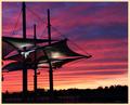
| 06/06/2004 04:12:16 PM | Three Sailsby ccaseyComment: I very rarely comment on, and never "adjust" the score because of, borders, but I feel that this one really detracts from a nice pictures. The colors are so rich and deep, and the border looks so "unnatural." Great shot, otherwise. 8 |
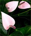
| 06/02/2004 12:13:54 AM | Three Pink Pokersby trainComment: I really like the composition of this, and the contrast of the pink and green is nice. If it would have been possible to make the pinks a bit "richer" it would really have some power to it. | | Photographer found comment helpful. |
| 05/31/2004 08:55:15 AM | Three Transplantsby soupComment: I really like the contrast between the orange and green in this shot. It is technically well done as well, but doesn't "move" me on an emotional level. 6 | | Photographer found comment helpful. |
|
Showing 6061 - 6070 of ~9205 |
Home -
Challenges -
Community -
League -
Photos -
Cameras -
Lenses -
Learn -
Help -
Terms of Use -
Privacy -
Top ^
DPChallenge, and website content and design, Copyright © 2001-2026 Challenging Technologies, LLC.
All digital photo copyrights belong to the photographers and may not be used without permission.
Current Server Time: 07/25/2026 05:09:27 AM EDT.
|