|
|
|
Showing 5761 - 5770 of ~9205 |
| Image |
Comment |
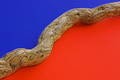
| 05/20/2006 09:47:52 AM | Don't People Care?!by glad2badadComment: CRITIQUE CLUB CRITIQUE
by karmat
On a personal note, first, I totally agree. I love to fish (used to go a lot more than I do now) and I have grown up around sportsmen all my life. It galls me how some people use and abuse the very environment that gives them pleasure. Fishing line wads like this really disturb me because that stuff is so darn strong and dangerous to any animal that gets wrapped up in it. oh yea, you did throw it away didn't you? ;)
As a photograph, my first impression is that it technically well done and the composition does a good job at contrasting the line with the grass showing that the line is obviously somewhere it does not belong.
Technically, the colors are good and I think you have done a really good job of capturing the line without it "artifacting" or having weird patterns of light in it.
As a picture there isn't anything I can offer to really change about it. It makes a statement, and it makes it well. Perhaps for this challenge, a dead fish or something would've given it more impact, but I don't suppose that was possible.
Best to ya in future challenges!
karmat |  Photographer found comment helpful. Photographer found comment helpful. |
| 05/19/2006 04:14:49 PM | Dangerous Paths: Cyclingby electinaComment: CRITIQUE CLUB CRITIQUE
by karmat
My first impression upon seeing this was, "OUCH!"
Compositionally, you have done well by having the tree in the left side of the frame with the bike "hanging" out into the right. Still, though, because the bike is the primary focus, it still feels centered in the frame. This could be making the shot a bit less dramatic than intended. Maybe if there was an angle that wasn't quite so "straight" on it would have had a bit more interest.
Technically, the focus is okay but the exposure leaves a bit to be desired, I think. The details in the black parts of the bike are obscured, and the sky is completely blown out. It could be that the contrast was upped a bit too much. Perhaps, instead of adjusting contrast, you played with levels or curves (or your software's equivalent, if existing) and lightened the darks while not blowing out the sky. Also, desaturating the greens would help that not to "compete" so with the bike. Not knowing what is on the other side of the tree, and assuming it is something like a crocodile infested pond, I won't suggest that you should have moved to the other side to avoid the blown-out sky. :)
It is a truly neat idea.
Best to you in future challenges.
karmat | | Photographer found comment helpful. |
| 05/19/2006 03:50:33 PM | Dark Parallel Choreographyby ladibugComment: CRITIQUE CLUB CRITIQUE
by karmat
Greetings! This was a very interesting idea. I like the balance between the ballerina and the shadow, and those two with the music.
Compositionally, I think it feels pretty strong and "stable" by having the actualy "dancer" on the left third and the shadow stretching out further across the frame. I do think it would have been interesting, if possible, if the music filled the frame instead of stopping half way down.
Technically, the blacks look a little like muddied or dark browns to me and the background also has a yellowish cast to it. For this type of shot to really work, I think you need crisp, clean whites and dark blacks. Perhaps a white balance adjustment (minor) or convert to bw and bump up the contrast. You didn't leave any comments, so I am not sure what you tried or what you were going for, so just take my opinions as that, opinions. :)
The only thing that just really bugs me about the shot are the three light reflections on the face on the right. Since this was advanced editing, I would have cloned those puppies outta there. Again, not knowing what you were going for, I am assuming you left them in there for a reason. BUT, it makes it look like a really screwy face with two eyes and a tiny little mouth. Once I noticed them, they were very obvious and distracting to me, others may have felt differently (and upon reading your comments, I see that they did).
:)
Again, this is a marvelous idea that I really like.
Best wishes in future challenges.
karmat | | Photographer found comment helpful. |
| 05/19/2006 12:12:29 AM | | | Photographer found comment helpful. |
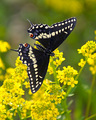
| 05/17/2006 09:57:52 PM | Debut Post Chrysalisby cloudsmeComment: CRITIQUE CLUB CRITIQUE
by karmat
My first impression was that this is a very nice shot of a butterfly, and my second impression was "What challenge is this?" :)
Compositionally, the picture feels a bit "top heavy" to me. Perhaps if there were a bit less flower at the bottom, and a bit more "space" at the top, it would feel more balanced and stable. Right now, it is almost as if the butterfly is preparing for a kamikaze downward dive. I do like that the butterfly is slightly angled. This gives it a more realistic feeling to me.
Technically, the exposure is great on this. There are details throughout the shot, and the colors are distinct. The focus looks okay, but there are a couple of spots (the flowers on the right, just under the bfly and the top of the bfly) that look a touch oversharpened. I also think a slight desaturation of the yellow and greens would help to emphasize the butterfly more.
As I alluded to in my greeting, this doesn't scream "movie" to me, though it sorta whispers "documentary." The picture itself does not compel me to want to watch the movie, though the shot itself is very well done. Also, the title (which I normally ignore, except in challenges like this) seems contrived to make the shot fit into the challenge, which might have turned some of the voters off.
Overall all, though, a nice shot, and you can be proud of yourself for capturing this as well as you did.
Best to you in future challenges.
karmat | | Photographer found comment helpful. |
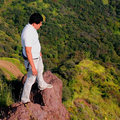
| 05/14/2006 11:06:54 PM | "Look Before You Leap"by NoahGoldmanComment: CRITIQUE CLUB CRITIQUE
by karmat
Very interesting shot. Glad I was not your model! You do well at giving the impression of extreme height (perhaps because it is extreme height)and that helps to draw the viewer into the picture and make it interesting for them.
Initially, the composition works because having the guy in the left 1/3 of the frame gives it a stable feeling, but then I saw that little tiny dude "behind" the subject. Because the viewer tends to look in front of the subject (on the right), the little spot may be missed and it helps to add to the feeling of height even more.
Technically, the exposure seems okay, there are details throughout, but the saturation seems a bit strong, especially on the skin tones.
Good work and best wishes in future challenges.
karmat | | Photographer found comment helpful. |
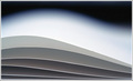
| 05/14/2006 11:01:36 PM | wavesby k4ffyComment: CRITIQUE CLUB CRITIQUE
by karmat
My first impression of this is that it is a very clean, eye-pleasing image.
Compositionally, it has some interest with the "flowing" left to right, and that being almost, but not quite, exactly "set up" by the lighting (?) in the background.
I also like the "stacking" of the grays. It gives it a graduated feeling, and makes it feel more stable on teh bottom of the shot.
The only "nitpick" I can find, is that it is a bit "flat" in subject. No pun intended. There is little or no feeling of depth to it. Whilst that may have very well been your intention (and I honestly think it sorta works here), the voter's may have been a bit put off by that (but with a score of 6.1ish, it's nothing to be ashamed of. :) )
Good work, and best wishes in future challenges.
karmat | | Photographer found comment helpful. |
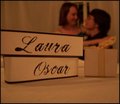
| 05/14/2006 10:57:09 PM | The Gift of Loveby OddfrogComment: CRITIQUE CLUB CRITIQUE
by karmat
Just scanning your comments, I see that you are a member of one of the comment traders, which is great. Having said that, you have probably gotten some great feed back on this shot already, so I will just leave you with my impressions.
The composition and set up is definitely eyecatching and pleasing to me. One thing that helps it in my opinion is that the namecards, box, and people form a triangle which is a "stable shape" of sorts. For me, personally, I would like less foreground and more space at the top and maybe a slightly tighter crop on the left and right.
I saw your comment about white balance adjustment and I think that would have done wonders. Barring that, perhaps converting it to black and white and adjusting the contrast may have help hide the initially obvious flaw in the picture -- the color cast.
Where is Witbank? My foreign geography is terrible, but I have family (actually husband's family) living in Klerksdorp (sp?) right now.
Please don't take this the wrong way, but since you have 8 or 9 people guaranteed to give you good comments, it would help the Critique Club's load if you would not check the box next time. I promise there is no hard feelings (my husband actually started the first one), and I understand that it could have easily been an oversight, just wanted to drop that!
Best wishes in your future challenges!
karmat | | Photographer found comment helpful. |
| 05/01/2006 12:28:26 AM | Divisionby nards656Comment: i know this picture. . .
I think it is cool, but I'm not voting on it . :) | | Photographer found comment helpful. |
| 04/30/2006 12:45:36 AM | Shirt & Tieby rwouthuisComment: Very nicely done. The colors are rich, the focus is spot on, and the exposure is good. | | Photographer found comment helpful. |
|
Showing 5761 - 5770 of ~9205 |
Home -
Challenges -
Community -
League -
Photos -
Cameras -
Lenses -
Learn -
Help -
Terms of Use -
Privacy -
Top ^
DPChallenge, and website content and design, Copyright © 2001-2026 Challenging Technologies, LLC.
All digital photo copyrights belong to the photographers and may not be used without permission.
Current Server Time: 07/27/2026 09:47:36 AM EDT.
|