|
|
|
Showing 5021 - 5030 of ~9205 |
| Image |
Comment |
| 04/17/2007 09:28:34 PM | Contre-jour Fleurby pla2Comment: CRITIQUE CLUB CRITIQUE
by karmat
Lovely use of sunflowers.
Compositionally, I like how the flowers look random, yet are balanced. The higher one serves as an immediate focal point, but then the eyes are drawn to the ones in the lower right. Also, there is the contrast between 1 and many. I don't know that I can/would suggest anything to change compositionally.
Technically, you have done well, also. You've met the challenge well, and I like that it is basically silhouetted, yet some of the color of the petals and stems "shines through." I'm not sure what you are using for a background, or what your options are/were, but the picture screams "YELLOW" to me. (If this were a yellow challenge, I would almost put money on this being a winner). I'm wondering if a blue background would give it a little extra contrast and interest?
Great score and placement, deservedly so.
If you have any questions, or if I need to further clarify or explain myself, please pm me.
karmat |  Photographer found comment helpful. Photographer found comment helpful. |
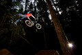
| 04/17/2007 04:21:38 PM | Rideby FaithlessComment: CRITIQUE CLUB CRITIQUE
by karmat
First off, great capture. I bet this was an awesome thing to watch!
Compositionally, the bike and rider are located at an effective point in the frame. It is balanced, and there is "room" for the rider to go, so it doesn't feel cramped or off-kilter. However, that bright light in the lower right competes with the rider for the viewer's attention, and that could be a minor distraction for some.
Technically, I'm sure this was a difficult shot to pull off in the best of situations, but it almost seems that the rider is too bright. while this effectively isolates him from the background, it almost gives it a "cartoonish" feeling.
I think, technically, you met the challenge. Like someone else mentioned, this would have probably fit better in the bicycle, or even fitness, challenges, but the dates don't always allow for that.
This is a great action shot.
If I need to further explain or clarify anything, please feel free to pm me.
karmat |
| 04/17/2007 03:24:57 PM | Escape from Solby dahvedComment: CRITIQUE CLUB CRITIQUE
by karmat
Wow, you have the elements here for a really good photo. Deep blue sky, interesting clouds, silhouetted subject, and lens flare that is not obnoxious but actually adds to the composition.
Compositionally, I really don't think the vertical crop is working well here. I don't know what was on the left or right of the crop, but if it was "empty" I think a horizontal crop would have made shot seem more balanced, overall. It simply feels "tight" on either side. The eyes go from the blimp to the sun back to the blimp, which is good, but it almost feels like there should be another element somewhere. Also, the blimp seems to be heading out of the frame, which doesn't help the sense of balance or movement either. If it were pointed the other way, or had more "space" in front of it, it would actually be fairly effective at adding some dynamics or "movement" to the picture.
Technically, the shot is well done. As mentioned earlier, the flares actually add to the shot, I think, and the blimp makes a nice silhouette against the sky.
You met the challenge, well, I think, but there were just a few details that would not compel the viewer to stay with this image longer. Well done, and best to you in future challenges.
If I need to further clarify or explain anything, please feel free to contact me.
karmat | | Photographer found comment helpful. |
| 04/17/2007 12:44:48 PM | Eat fruitby marvinComment: CRITIQUE CLUE CRITIQUE
by karmat
Interesting approach to the challenge.
Compositionally, I find this to be very static. It is 'flat' horizontally, and it is centered. While this can be effective in some situations, I think in this one, it is just "there" and doesn't add interest, context, or anything to compel the viewer to keep looking at it. I think perhaps turning it on a diagonal so that it "starts" in one corner and leads to the other would help a little bit. Also, if it filled up more of the frame, it might be a bit more interesting.
Technically, it is a very crisp image. The white background is very clean and clear of distractions. The colors are okay and the focus seems okay as well. To me, it seems to have the "edginess" that says "overprocessed" for whatever reason.
I applaud your willingness to approach the challenge from a different perspective. Eating healthy is definitely part of it.
If I need to further clarify or explain anything, please let me know.
karmat | | Photographer found comment helpful. |
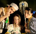
| 04/16/2007 09:10:08 PM | Getting ready to add some speed to the speed challengeby zoolComment: CRITIQUE CLUB CRITIQUE
by karmat
Compositionally, this is a strong and balanced picture. None of the objects overwhelm the others, and it is composed in such a way that the eyes are given "paths" to "travel" through the frame which adds interest to the shot.
Technically, it is dark, but that seems befitting to the mood and subject. It seems a bit flat, so a small boost to contrast may help, BUT, I'm viewing on my laptop, and everything seems to end up looking flat on it. :)
You have done well at including all the required components without it looking contrived and forced. Good work.
If I need to further clarify or explain anything, please feel free to contact me. | | Photographer found comment helpful. |
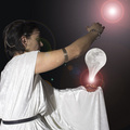
| 04/16/2007 08:56:36 PM | 10 minutes and the moon will be changedby Rino63Comment: CRITIQUE CLUB CRITIQUE
by karmat
Compositionally, this is a very strong image. The person, the moon, and the upper circle form a triangle that gives the eyes a way to move through the picture. Also, the right arm helps to direct the eyes upward.
Technically, you have done well at combining the different images to "fit" with each other. I think the thing that is most distracting to me is that it looks like the light should be coming from the "moon" yet the white dressing gown is very bright, seemingly lit from the opposite side. This is a small detail, but one that doesn't add to the reality of shot.
Otherwise, a neat idea, and good execution. I'm frankly surprised it didn't score higher.
If you have further questions, or need me to clarify or explain something, please let me know.
karmat | | Photographer found comment helpful. |
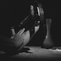
| 04/15/2007 10:04:15 AM | Disc Errorby GrandadComment: CRITIQUE CLUB CRITIQUE
by karmat
Great idea.
Compositionally, this is very well balanced. The needle of the record player on the upper right, and the disc being in the lower left gives this shot a sense of balance. Also, I think the perspective is good. It is high enough to give a sense of what you are looking at without being straight down and static.
Technically, it feels soft, even though the title is very obviously focused. I think because the foreground is a touch soft, as can be seen in the writing, and the little stick holder thingy is soft, and that is what the eye is drawn to first, it gives an oof impression, even though it is more of a reverse shallow dof. Also, the lighting is a little undramatic. I'm not sure exactly how it could be improved, other than making it a bit brighter so the colors stand out more.
Good idea and it is a good fit for the challenge, I think.
If I need to further explain or clarify, please feel free to contact me.
karmat | | Photographer found comment helpful. |
| 04/15/2007 09:37:33 AM | It's a Shore Thing!by escapetoozComment: CRITIQUE CLUB CRITIQUE
by karmat
Awesome idea and processing. The coloring works well on this to give it a "yesteryear" feeling.
Compositionally, a lot of times the "centered" subject doesn't work well, but in this shot, it helps to focus the viewer's attention on the subject and assists in giving the shot that vintage feel.
Technically, it is also well done. The shadow across her face is a double edged sword. On the one side it is a little distracting to not see the top of her face clearly, but on the other, it really helps to add "context' and 'realness' to the shot.
It wasn't immediately obvious to me how this shot fit the challenge, other than realizing that most models, in this setting, have substantially less clothing on. I know models can be difficult to scrounge up, but the 'anachronism' part of this challenge could have been made really humorous if there were two or three really hip/modern looking guys standing around in obvious modern swimsuits. Granted, this would change the entire feeling of the shot, but it would be another direction you could take, if you ever felt inclined to reproduce it.
Good work and good showing in the challenge!
Please feel free to contact me if I need to clarify or further explain myself.
karmat | | Photographer found comment helpful. |
| 04/13/2007 11:10:46 AM | | | Photographer found comment helpful. |
| 04/11/2007 08:37:13 AM | | | Photographer found comment helpful. |
|
Showing 5021 - 5030 of ~9205 |
Home -
Challenges -
Community -
League -
Photos -
Cameras -
Lenses -
Learn -
Help -
Terms of Use -
Privacy -
Top ^
DPChallenge, and website content and design, Copyright © 2001-2026 Challenging Technologies, LLC.
All digital photo copyrights belong to the photographers and may not be used without permission.
Current Server Time: 05/12/2026 01:02:26 AM EDT.
|