|
|
|
Showing 5001 - 5010 of ~9205 |
| Image |
Comment |
| 05/04/2007 10:37:04 PM | Just Dandyby panderbearComment: edit -- welcome to finally entering the challenges here!!! you've been here awhile, haven't you? :) |  Photographer found comment helpful. Photographer found comment helpful. |
| 05/04/2007 10:36:11 PM | Just Dandyby panderbearComment: CRITIQUE CLUB CRITIQUE
by karmat
Compositionally, I think this shot could be cropped to emphasize the rule of thirds more, and to give it a stronger composition. I think cropping some off of the left and a lot off of the bottom would close the frame into the hand and the flower more, and wouldn't have the distracting empty space at the bottom. It doesn't quite fit the shot well enough to be "negative space" so it becomes a distraction rather than an asset. Also, that would set up a diagonal "line" between the flower and the hand, and would make the hand to appear out of nowhere. As a result, the viewer's eyes would go from flower to hand and back to flower.
Technically, I like the brightness and richness of the colors in this shot. There is a good balance of contrast, and the details are fabulous. The lighting may be a touch harsh, but I tend to like that effect.
Overall, it is a good shot that meets the challenge, if not in a direct way, at least in a subtle way.
Welcome to dpc, and I look forward to seeing more of your entries!
If I need to further clarify or explain, please feel free to contact me by pm.
karma | | Photographer found comment helpful. |
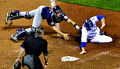
| 05/04/2007 08:06:44 PM | Baseball's Back!!!by harmsusmcComment: CRITIQUE CLUB CRITIQUE
by karmat
My first impression was that you had captured an excellent action shot with some fantastic colors. I assume "grid" could be distracting to some, but it made me feel like I was there.
Compositionally, it isn't so much your use of the rule of thirds that makes this image strong. While it does follow the ROT, it is a subtle use. What strikes me is the strong triangle formed between the umpire, runner, and catcher. That helps to make this image have a lot of stability and gives the eye a "complete circuit" to review without ever leaving the frame. This shape is complimented by the home plate and base lines.
Technically, the focus is great on this and the colors are awesome. Very nice work. I really like the contrast on this. (Note -- I'm on my laptop, so it *could* appear over-contrasted to some, my monitor is notoriously flat, sometimes)
Overall, I think it probably suffered, if any, from the ultra-subtle use of the rule of thirds. In a sports challenge, or action shot challenge, this would, without a doubt, score much higher.
Best to you in future challenges. If I need to clarify or explain myself, please feel free to contact me.
Karma | | Photographer found comment helpful. |
| 05/04/2007 07:35:48 PM | casualty of an ill-conceived feastby cincolas1Comment: CRITIQUE CLUB CRITIQUE
by karmat
First impression -- Honestly, I kinda went, "huh?" Then, I read the title, looked closer at the picture, and had to laugh, more out of experience, than anything.
Compositionally, the framing you have chosen isn't really interesting to me. There is nothing really to "rest" the eyes on, and no where for them to "go" within the picture. Therefore, without the title, the viewer may miss the "story" behind the shot.
Technically, the focus and exposure is good, and the bw works well.
If you wanted a higher score, I would suggest trying a couple of things. Having some "context" in the background could add some interest to the "story" and would help to draw the viewer in. Too much, though, and it will overshadow the subject and be distracting. Another option would have been to rotate it to the right about 30 degrees so that it was in the diagonal in the frame. If nothing else, this would help to add some "motion" to the shot, and it wouldn't feel quite so static.
If I need to further clarify or explain myself, please feel free to contact me.
Karma | | Photographer found comment helpful. |
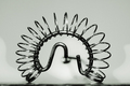
| 05/04/2007 12:12:49 AM | whisk - close-upby alpharichComment: CRITIQUE CLUB CRITIQUE
by karmat
There is a small amount of irony that I've drawn your image to critique. I thought about this exact same shot with a miniature wire whisk that I have. :)
Compositionally, I think this is one of the few shots that works with basically a centered composition. Perhaps it is because the whisk is dominantly circular shaped. It doesn't have the static feeling that many centered shots have. It is also helped by the fact that it sits low in the frame, and that gives it a balanced, stable feeling. Also, the coiling of the whisk gives the eyes a path to follow through the frame.
Technically, it is also well done. The focus is right on, and the shallow dof helps the handle to "disappear"and not be a distraction. Exposure is good and you have controlled the reflections well enough that they are not blaringly distracting.
overall, it is a technically well-done shot, but it lacks some appeal to really make the viewer stop and go "WOW." (Well, I did, but that was for the reason mentioned above). There is little to grab the eye past the initial viewing of a well shot whisk. A different angle may have helped (at the risk of losing the nice shape you have) or a different background. Putting the whisk in front of something related may have helped give it more context and interest, or even just a brightly colored background. DPC seems to like bright blue. :)
Nicely done. If I need to clarify or further explain myself, please feel free to contact me.
Karma | | Photographer found comment helpful. |
| 05/03/2007 11:12:38 PM | KitchenAidby fannsiComment: CRITIQUE CLUB CRITIQUE
by karmat
If I were to try to use one word to describe this image, it would be "polished." It is very professionally done -- good focus, details, etc. and would make an excellent advertising image for KitchenAid, I think.
The focus is located on the exact point that the eyes first go to in the image, and though the rest of the image is sufficiently "blurry" it is okay, because the eyes and see (and rest on) what they need to.
The blue hues don't do much for me, in this image, but it is not distracting enough to suggest anything else, either.
karmat |
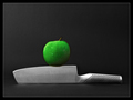
| 05/03/2007 06:15:01 PM | On The Edge by DUCATISTAComment: CRITIQUE CLUB CRITIQUE
by karmat
It is truly difficult to "critique" a ribbon winner without sounding like I am just searching for things to complain about.
So, I'll tell you what I think works in this shot, and what was appealing, and what I *personally* think could be "improved" upon.
Technically, you have nailed it. The lighting on this is consistent and even. This allows for details to show throughout the shot. It also makes for a very clean, well focused shot. The slight shadowing on the apple also gives just a touch of depth, otherwise the shot might appear to be a bit flat. The focus is good and the water on the apple gives it a nice touch.
Compositionally, to me, it is static. To have the knife straight through the shot, gives it kind of a "ho-hum" feeling. Granted, the knife is in the lower third of the picture, and that gives it a sense of strength, and the apple is just off of center, so that helps to counter the "static" feeling, but it doesn't add any real interest to the shot.
I think technically, you have done a very good job, and the voters rewarded you handsomely for that. Congratulations! This would be an excellent stock type shot as well.
karmat | | Photographer found comment helpful. |
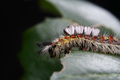
| 04/29/2007 07:21:39 PM | "Darn it! I hate it when I drop my keys," says the tussock moth larvae.by Sting11165Comment: CRITIQUE CLUB CRITIQUE
by karmat
Compositionally, you have helped this shot be stronger by having the two halves of the shot have contrasting light and dark. If the background had been consistent, I think this shot would have a static feeling because of the "centeredness" of the caterpillar. I also like how it looks like he (she?) is looking off of the leave. That makes it seem like there is something interesting down there that we want to see. I agree with your comments that a different crop would be even more effective (though not for the challenge).
Technically, you have nailed the exposure, focus, etc. I also think the shallow dof works on this. This is a very well done shot, especially considering the post processing limitations of the challenge.
Very nicely done, and I'm not sure I can suggest anything to make it 'better.' Good work.
If I need to clarify or explain myself, please feel free to contact me via pm.
Karma
|
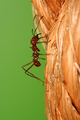
| 04/28/2007 08:32:05 PM | Uphill Struggleby splidgeComment: CRITIQUE CLUB CRITIQUE
by karmat
Wow. There's not a lot I can add to this. You have awesome colors that contrast nicely, great textures, good detail, etc. I, for one, am really glad that ants are not this size naturally. That is downright eerie looking.
You nailed the challenge, and did it well. Not sure why this would score a "one," but to each his own, I suppose. Great work.
The only nitpick I could possibly come up with, is the straight vertical lines in the image. The ant gives the shot some movement, but I *think* if it were set on a diagonal, it *might* be a bit more dynamic. But, like I said, that is a nitpick.
If I need to further clarify or explain myself, feel free to contact me via pm.
karmat | | Photographer found comment helpful. |
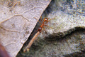
| 04/27/2007 11:47:14 PM | Strong Manby alpharichComment: CRITIQUE CLUB CRITIQUE
by karmat
I am looking at this picture and basing my suggestions as if it *could* have been edited. I fully understand that with this ruleset, it wasn't possible, so if I say things you already know, I apologize in advance.
Compositionally, the bug is too much in the center, and this causes the image to be static. I think for this image, cropping it with the bug in the upper right with the stick leading down and through the image would be most effective. Having said that, the fact that the left and right parts of the image are of different color and texture, and they are separated by a diagonal line, helps this image tremendously. The diagonal line gives it some "motion" and the diagonal line adds interest.
Technically, you have some wonderful textures in this shot, and they contrast nicely. I understand that the shallow dof was largely unavoidable, but I think if the stick (?) was more in focus, it would be an even stronger image.
The contrast, brightness, etc. is very good, especially considering no post-processing has been done.
If I need to further clarify myself, please feel free to contact me.
Karma |
|
Showing 5001 - 5010 of ~9205 |
Home -
Challenges -
Community -
League -
Photos -
Cameras -
Lenses -
Learn -
Help -
Terms of Use -
Privacy -
Top ^
DPChallenge, and website content and design, Copyright © 2001-2026 Challenging Technologies, LLC.
All digital photo copyrights belong to the photographers and may not be used without permission.
Current Server Time: 05/12/2026 02:03:58 AM EDT.
|