|
|
|
Showing 4941 - 4950 of ~9205 |
| Image |
Comment |
| 05/16/2007 11:27:59 AM | Autocrossby BagpussComment: CRITIQUE CLUB CRITIQUE
by karmat
That looks fun. Dirty, but fun. :)
Compositionally, it feels that the car is just a bit too centered.I keep wanting to see more to the left. That said, the white car in the background does provide a nice counter-balance to the primary car.
Technically, the focus, exposure, etc. is great. I really like how you have captured the dirt flying, and the blurry background helps to isolate the subject, and keeps it (the background) from being too distracting. I think boosting the colors (especially the yellow) *just a touch* and maybe just a bit of contrast boost, would really help this shot to *pop.*
Overall, nice work, and great action capture.
If I need to further explain myself, or clarify anything I have said, please feel free to contact me.
Karma |
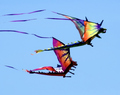
| 05/16/2007 10:18:29 AM | Kite Racingby sfaliceComment: CRITIQUE CLUB CRITIQUE
by karmat
Very interesting choice of sports. I've never understood kite racing, but then, I live in an area were kites aren't really practical, either (lots of trees and stuff).
Compositionally, I like the balance that the two kites present. One would feel isolated (and probably wouldn't show the race as well), but three would be crowded, I think. The only thing I might suggest would be to rotate the picture just a bit so that the flags were flying up into the frame at a diagonal. I think that would match the energy level of the bright colors, well. Straight horizontal works okay in that it shows a forward motion, but it still seems a bit static, in some ways. Also, don't know if it was possible or not, but cropping a bit off the bottom and leaving a bit more at the top would help it feel a little less top-heavy, I think.
Technically, I love the colors of this. The focus is right on in the body of the kites, so the details visible are wonderful. There is just a hint of blur around the edges and in the tales which helps to show the motion and "whipping" of the wind.
Overall, a very nice shot.
Best to you in future challenges. If I need to further clarify or explain myself, please feel free to contact me.
Karma |  Photographer found comment helpful. Photographer found comment helpful. |
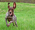
| 05/14/2007 11:59:40 AM | Go Dog. Go!by neophyteComment: CRITIQUE CLUB CRITIQUE
by karmat
Great action capture here. I also like the predominately green background, and how his ears are "up" and his tongue is out. That adds to the comical effect.
I think it would have been a stronger composition if the dog had been in the right side of the frame. As it is, it is in a "strong" part of the frame, but it looks like he is running out of it, and that makes it seems bit off-balance. Also, it looks like your camera focused on the back half of the dog (which was probably the front half when you started the shot, because the head and chest is just a touch soft, but his back legs are razor sharp.
I think it does fit the challenge, but it is not as "in your face" with the challenge theme as some of the top scorers.
Nice work and best to you in future challenges.
If I need to further clarify or explain myself, please feel free to contact me.
karma | | Photographer found comment helpful. |
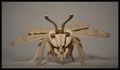
| 05/13/2007 11:51:58 PM | Be Beeby SimpaComment: CRITIQUE CLUB CRITIQUE
by karmat
It is symmetrical, so you have done well at meeting the challenge. My first impression is that subjects like this don't fair too well on dpc, and I suppose that is because there is an almost unconscious belief that if it is sitting still, everything should be perfect. There may be some validity to that, but it is not always possible. :)
Compositionally, the head on nature of the bee works well. It is easy to see the symmetry involved and makes the crazy thing look almost threatening.
Technically, the focus is good, but the gray-ness of the background makes it appear drab, and this steals the "energy" that the intensity of the bee projects. I think it would have been interesting to have this very obviously not real bee in a real setting out doors somewhere. That may have added an element of interest or drama to it. In the event that you couldn't get out, for weather or whatever purposes, a different color background would have been one more little thing that would have caught the viewer's attention and possibly compelled them to vote a touch higher.
If I need to further clarify or explain myself, please feel free to contact me.
karma |
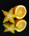
| 05/13/2007 11:46:27 PM | ~ Inner Symmetry~by annigComment: CRITIQUE CLUB CRITIQUE
by karmat
Nice work. The contrast between their shapes is very nice, yet their color tie them together. I like that there is slightly more space at the top than at the bottom. That keeps it from feeling quite so "centered" and thus static as a composition.
It is well lit and well focused. Mirrors are bears to focus in. Something about how the camera actually tries to focus on the back of the glass, no the image reflecting or something like that. I'm not sure how to get the reflection razor sharp (though at first glance, it is focused well enough to not be distracting, I think), but I have found if I can use as big an aperture number as possible, and not get horrendous glares on the glass, sometimes that helps.
It is a challenging shot, but you pulled it off well. Congrats on the good score.
If I need to further clarify or explain myself, please feel free to ask.
karma | | Photographer found comment helpful. |
| 05/13/2007 11:42:16 PM | The dry Woodby vishalpsuComment: CRITIQUE CLUB CRITIQUE
by karmat
Welcome to dpc!
This shot "feels" symmetrical in that it is balanced and has two "opposites" that counter eachother, but it is not quite truly symmetrical enough to really wow the voters. I suppose one could say that you have a metaphorical symmetry going on here.
I like how the two elements balance eachother. It is almost a life into death kind of relationship being portrayed. I think compositionally, it could be cropped tighter on either end forcing more focus onto the branch and the trunk. I also like the watery background. That is nice.
Technically, the exposure may be just a touch under, because while I can still see some bark detail, I had to look really hard. Maybe a slight slower shutter speed would have helped that.
Overall, not a bad shot, but it doesn't fit the challenge real well, and those tend to not do well in the challenges.
If I need to further clarify or explain myself, please let me know.
Karma |
| 05/13/2007 11:37:13 PM | Administration Buildingby JLCComment: CRITIQUE CLUB CRITIQUE
by karmat
Compositionally, you missed having some truly dynamic symmetry by needing to move to your left about a foot, or cropping it a bit wider on the left (or closer on the right) because it it shifted just enough to feel off balance. In lining it up with the edge of my monitor, it actually isn't tilted much at all, but the composition kinda makes it feel that way. Or maybe my monitor is crooked.
I really like the imposing structure of this, and the angle you are photographing it from helps to emphasize that. The colors are nice (warmified, I like that, I'll remember to use that sometimes) and the deep blue sky really adds a richness to this shot. You've also done well to keep some of the detail in the shadows, not an easy task to accomplish on a shot like this.
If I can further clarify or explain myself, please feel free to contact me.
Karma | | Photographer found comment helpful. |
| 05/13/2007 11:31:02 PM | A kiss can change your worldby djtiekComment: CRITIQUE CLUB CRITIQUE
by karmat
yea, I've had a few that begged for submission, too.
Compositionally, you have a good idea here. It is a very subtle symmetry (which may not have been obvious to some folks), so it meets the challenge. I do find the dark horizon behind them a bit distracting, especially since it "cuts" straight through their chest areas. It might have been a neat effect to get on your knees, or squat down so that you were looking up at them.
Technically, the silhouette and the blue hues are nice. Even though we can't see their face, they don't look particularly happy, though. It looks like he is leaning in to kiss her nose, and she is almost pulling back. I think something simpler like having both of them lean in and touch foreheads would have been more effective.
The background looks like it was stunning, and I bet you got some shots that they will treasure always.
If I need to further clarify or explain myself, please feel free to contact me.
Karma |
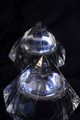
| 05/13/2007 11:25:30 PM | It's somethingby The_squirrelComment: CRITIQUE CLUB CRITIQUE
by karmat
Compositionally, this shot feels terribly off-balanced. It is cut off at the bottom and has space at the top, which gives it a bottom-heavy feeling. Sometimes, that can be good, but I think in this shot, it kinda makes it look like an accident.
Technically, the lack of focus killed you, I think. Photographing glass is incredibly difficult because a lot of cameras "see through" the glass and focus behind it. Also, it almost looks like you were using a mirror, so that added to the difficulty. If you ever wanted to reshoot this, and I think it could make a great picture because all of the facets of the glass would give a lot of detail and interest, I would suggest using a tripod, an aperture setting of around 8 or 11, a slow enough shutter speed, and an iso as low as possible, to get a good exposure and not have noise issues. Also, get down level with the glass, and don't take the shot from up above, unless that is the angle you want. In that case, make sure you "work it" to see as much of the detail as possible. And don't be afraid to crop in close, or use different colored lights (putting a colored napkin or cloth over a flashlight can sometimes give you just enough hue, then in post processing, you can bump it up a bit) -- I bet this would make an awesome abstract.
Best to you in future challenges.
Karma |
| 05/13/2007 10:14:27 PM | Shapeby TimmyQComment: CRITIQUE CLUB CRITIQUE
by karmat
Admittedly, I love minimalistic photography, but this shot absolutely rocks. It's simplicity speaks volumes, I believe. It meets the challenge well, as it is symmetrical, and it balances space and 'occupied space' well too.
I honestly cannot come up with anything to make this a better shot, unless it would be to use another color for the light, just to grab the viewer's attention. Obviously, most of the commenters liked it as well, pulling from five years of dpc experience, I suspect most of the low voters are people who do not like minimalistic shots, people who like for the story to be told within the photograph (whereas your shot tells the story by what is NOT in the photograph), or think that shots like this are simple to achieve. It's not that they are wrong or bad or shouldn't be voting, that is just some of the voter mentality that is out there.
6.2 for your first challenge is not bad AT ALL, and you have a shot you can definitely be proud of. I look forward to seeing your future entries, and will be looking for one of your shots on the front page, soon.
Karma | | Photographer found comment helpful. |
|
Showing 4941 - 4950 of ~9205 |
Home -
Challenges -
Community -
League -
Photos -
Cameras -
Lenses -
Learn -
Help -
Terms of Use -
Privacy -
Top ^
DPChallenge, and website content and design, Copyright © 2001-2026 Challenging Technologies, LLC.
All digital photo copyrights belong to the photographers and may not be used without permission.
Current Server Time: 05/12/2026 05:14:29 AM EDT.
|