| Image |
Comment |
| 06/02/2007 09:11:49 PM |
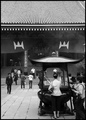
Faithby lilacbutterflyComment: i like the composition on this, but the post-processing/high contrast yellowish cast doesn't appeal to me. |
 Photographer found comment helpful. Photographer found comment helpful. |
| 06/02/2007 09:10:20 PM |
|
| Photographer found comment helpful. |
| 06/02/2007 09:09:00 PM |
Secluded Templeby shalrathComment: the softness gives it an ethereal feeling. I like the way the tree "frames" inpart, the temple. |
| Photographer found comment helpful. |
| 06/02/2007 09:06:30 PM |
|
| Photographer found comment helpful. |
| 06/02/2007 08:59:56 PM |
|
| Photographer found comment helpful. |
| 06/02/2007 08:56:18 PM |
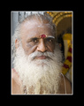
Hindu Monk in The Templeby katemullerComment: Nice portrait. Good lighting and detail, and a very interesting face. Would like to see more of it and less of the frame, though. ;) (If I were framing it, that is a nice proportion for matting, but for dpc, I think more picture would be nice.) |
| Photographer found comment helpful. |
| 05/30/2007 10:49:35 PM |
|
| Photographer found comment helpful. |
| 05/30/2007 10:37:35 PM |
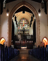
The Cathedral of Methodismby Rae-AnnComment: nice perspective, but it looks a bit oversharpened to me, or perhaps it was underexposed and the brightening in post-processing gave it that effect. |
| Photographer found comment helpful. |
| 05/27/2007 11:19:17 PM |
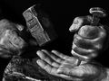
Drawing Linesby pix-alComment: CRITIQUE CLUB CRITIQUE
by karmat
I like the balance between the pencil and lines -- there is enough "contrast" in direction (basically horizontal vs. vertical) to make it interesting, yet enough consistency to tie it together (both the pencil and the lines form a "v" shape).
I also think the bw works very well with this (you have good tones and contrast), and the focus/dof choices you have made help to make this a very interesting.
My initial impression was "???" but the more I look at it, you have some interesting "vanishing points." I don't know that any of them fit the "classical" definite of vanishing point, but if everything did, that wouldn't be a lot of fun, would it? The line on the left is the more "obvious" vanishing point. I think if you had made it extend up and out of the frame, it would have "fit" that definition more, but I'm not sure it would have helped the balance of the shot, much. Also, the pencil forms a v-shape which is kind of a vanishing point as well. But, the one that amuses me, is the point of the pencil that has 'vanished' from the end of the pencil. :)
A good shot, maybe a bit too subtle in the rushed voting of dpc, but very interesting and well done.
Karma |
| 05/26/2007 01:33:22 PM |
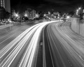
Fast andSlowby mkcarreiComment: CRITIQUE CLUB CRITIQUE
by karmat
compositionally, this is a very strong image. I like how the "lines" start at the bottom of the frame and lead up and into it. The curve also gives the photo a nice shape. It feels symmetrical, without being perfectly symmetrical.
Technically, it is also fairly well done. The focus is okay, though I think if the buildings were a bit sharper, the overall image would have been stronger. Finally, I think the contrast needs to be boosted just a hair. The "whites" are good, but the rest seems kinda flat and gray.
Good work, and best to you in future challenges.
Karma |
| Photographer found comment helpful. |
Home -
Challenges -
Community -
League -
Photos -
Cameras -
Lenses -
Learn -
Help -
Terms of Use -
Privacy -
Top ^
DPChallenge, and website content and design, Copyright © 2001-2026 Challenging Technologies, LLC.
All digital photo copyrights belong to the photographers and may not be used without permission.
Current Server Time: 05/12/2026 10:41:22 AM EDT.