| Image |
Comment |
| 04/16/2009 11:13:18 PM |
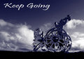
Keep Goingby bbrightComment: CRITIQUE CLUB CRITIQUE
by karmat
Compositionally, this is a very strong image. The lower camera perspective, and having the subject in the lower right works well for a balanced image.
Technically, there is blaringly wrong with this image. It is well-focused, your exposure is good, and the color tones are excellent.
Overall, it is a very good image. For the challenge, though, it is kind of weak on the "postcard" element. While I could see this being the type of card a tourist would buy if they were visiting this monument, for those that do not know what it is, or it's significance, it rather comes across as "I have a really good picture, so I will put it in this challenge."
Nice work and best to you in future challenges. |
 Photographer found comment helpful. Photographer found comment helpful. |
| 04/16/2009 10:12:14 PM |
|
| Photographer found comment helpful. |
| 04/07/2009 02:02:23 PM |
|
| Photographer found comment helpful. |
| 04/06/2009 11:46:06 PM |
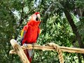
1) Redby WriteHeartComment: I hope you don't mind, but I played with this some, because you have a lot of potential in this shot. The red bird against the green background, with the yellowish perch makes for a very pleasant and striking color arrangement.
I use PaintShopPro, so first I hit it with clarify a couple of times. If you use PS, I *think* highlight/shadow does something very similar. Then, because clarify takes some of the color out, I saturated it some.
Then, I used levels to give it more contrast. Admittedly, this made it lose a bit of the detail, especially in the feathers, but it also made the ever so slightly appearance of being out of focus not so noticeable. Also, I really like high contrast pictures and this definitely shows my biased, but less levels adjustments would back it of some.
Finally, I cropped it to get the bird out of the middle and more to the left of the frame and balanced with the perch going out of the right hand side.
Here are a couple of takes -- I will remove it from my portfolio if you want me to.
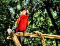
A less contrasty version --
|
| Photographer found comment helpful. |
| 04/06/2009 11:16:07 PM |
|
| Photographer found comment helpful. |
| 04/06/2009 11:15:48 PM |
|
| Photographer found comment helpful. |
| 04/06/2009 10:48:49 PM |
|
| Photographer found comment helpful. |
| 04/06/2009 08:58:40 PM |
Color in Motion by pearlseyesComment: CRITIQUE CLUB CRITIQUE
by karmat
Compositionally, this is a very strong image because the "knob" part rests in the lower left third with the nice colors then filling in the rest of the composition.
Technically, the colors are great, and the smoothness of them really helps to add to the feeling of motion. The "knob" is seems a bit out of focus (probably motion blur) to me, but the rest of the shot effectively pulls the eyes away and it isn't as noticeable.
Overall, a very good picture.
Karma
|
| 04/06/2009 08:51:57 PM |
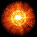
Out-burst of fire ball by sekarmalathyComment: CRITIQUE CLUB CRITIQUE
by karmat
My first glance led me to think this was one of those fiber optic globes or something.
Compositionally, this works very well with a square crop I think. It helps to lead the eye to the middle of the frame. It also works well that it is basically symmetrical and no one part of the "strata" of colors is off-balanced.
Technically, it is very well done. A lot of times this technique is better described as "blurry mess" rather than implying motion.
Overall well done, and obviously worked well for the voters. :)
Karma |
| Photographer found comment helpful. |
| 04/04/2009 04:39:10 PM |
|
| Photographer found comment helpful. |
Home -
Challenges -
Community -
League -
Photos -
Cameras -
Lenses -
Learn -
Help -
Terms of Use -
Privacy -
Top ^
DPChallenge, and website content and design, Copyright © 2001-2026 Challenging Technologies, LLC.
All digital photo copyrights belong to the photographers and may not be used without permission.
Current Server Time: 06/16/2026 11:49:48 AM EDT.