|
|
|
Showing 211 - 220 of ~9205 |
| Image |
Comment |
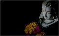
| 06/08/2009 01:27:42 PM | Still Lifeby rkaushikComment: CRITIQUE CLUB CRITIQUE
by karmat
Compositionally, I like how the subject is in the right side of the frame and how you have used a clean black for negative space. A couple of different things could have been done to make it a bit more dynamic though. From the higher angle, it looks like she is looking down on the flowers which is nice; however, the angle itself is rather stale. Higher might give it more of a dramatic feeling, or lower to show more of the detail of its face. If you really like this angle, I think zooming in and cropping it very very close.
Technically, I think this photo falls short. The focus is good, but the lighting is not. It looks underexposed and this causes it to seem very very flat, and un-appealing. With better/brighter lighting, I think this could have been a very intriguing still life.
karmat |
| 05/14/2009 10:04:44 PM | Uniqueby VitaminBComment: There is a certain amount of irony here -- two shots, same in concept, same in caption for "Unique." :) |  Photographer found comment helpful. Photographer found comment helpful. |
| 05/01/2009 02:28:25 PM | | | Photographer found comment helpful. |
| 05/01/2009 02:26:51 PM | | | Photographer found comment helpful. |
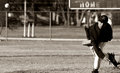
| 05/01/2009 02:24:35 PM | watching itby bmartuchComment: I almost missed the ball. There is a bright white object/reflection/glare underneath it and I actually noticed it first. However, the crop made me pause long enough to ask, "WHY would someone crop a picture like that that?" and that make me look a bit more closely. | | Photographer found comment helpful. |
| 05/01/2009 02:19:00 PM | | | Photographer found comment helpful. |
| 04/28/2009 09:05:03 AM | |
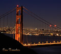
| 04/18/2009 11:20:52 PM | Golden Gateby DigiFotoBuddyComment: CRITIQUE CLUB CRITIQUE
by karmat
Compositionally, this is a very strong shot. The city in the background and the bridge make a nice balanced composition. However, it does feel ever so slightly tilted to the right. I know part of it is a perspective thing -- it would be difficult to get the background straight without making the bridge look weird, but the verticals on the bridge look a bit slanted as well. I do find myself wanting just a bit more "stuff" on the right, but overall, nicely done.
Technically, the exposure, focus and colors on this are very well done, very attractive, and very pleasant to look at.
The script you have chosen works very well.
Overall, a great shot (one of my higher scorers) and definitely one you can be proud of.
Karma | | Photographer found comment helpful. |
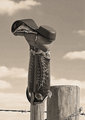
| 04/17/2009 11:06:33 AM | Old Bootby CitadelComment: CRITIQUE CLUB CRITIQUE
by karmat
I like the composition of this. The height of the boot, and the fence post create a nice balance of the elements. It feels a bit "narrow," but not incredibly so.
Technically, I like the tone of this and the exposure and focus is good. It appears oversharpened to me, and this is also causing an ever-so slight halo effect around the boot. Of course, it is a "texture" challenge, so maybe oversharpening is a good thing. :)
Overall, it is a nice shot, and *I* can see how it meets the challenge, but it does so subtlely, and doesn't scream TEXTURE as much as some of the others did.
Best to you in future challenges.
Karma | | Photographer found comment helpful. |
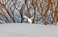
| 04/16/2009 11:30:12 PM | Ptarmiganby diverssComment: CRITIQUE CLUB CRITIQUE
by karmat
Compositionally, this shot is lacking. The bird is in the center, which can work sometimes, but because it is such as small part of the picture, it really gives a haphazard, unbalanced feeling to the shot. Having the bird fill a larger part of the frame, or having it on one side (probably the right to give the appearance of flying into the frame) would have made that element of the shot much stronger.
Technically, you have nailed the exposure and focus (on the bird). The details are visible, but there is enough contrast that it doesn't appear "flat." Had you been able to blur the trees/plants in the background, I think that would have made the bird stand out more. Looking at your settings, perhaps you could have dropped down to a lower ISO number, a lower f-stop number and gotten a more shallow dof. Of course, I have no idea how far away you were from the bird, or how close the bird was to the background, so even that may not have helped. As it is, though, with the background vegetation being only slightly less focused than the bird, the bird kind of just blends in.
Overall, it is a fairly good shot. I could see it being used for a postcard depicting native animals of this area, but it doesn't give a really strong feeling for anything but that, and some voters may have been wanting "more" context.
Karma |
|
Showing 211 - 220 of ~9205 |
Home -
Challenges -
Community -
League -
Photos -
Cameras -
Lenses -
Learn -
Help -
Terms of Use -
Privacy -
Top ^
DPChallenge, and website content and design, Copyright © 2001-2026 Challenging Technologies, LLC.
All digital photo copyrights belong to the photographers and may not be used without permission.
Current Server Time: 06/18/2026 12:29:26 AM EDT.
|