| Image |
Comment |
| 03/03/2008 11:29:05 AM |
|
 Photographer found comment helpful. Photographer found comment helpful. |
| 03/03/2008 11:27:37 AM |
|
| Photographer found comment helpful. |
| 03/03/2008 11:26:23 AM |
|
| Photographer found comment helpful. |
| 03/03/2008 11:24:24 AM |
|
| Photographer found comment helpful. |
| 03/03/2008 11:07:34 AM |
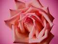
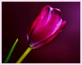
COLORS!by Rachel53Comment: A sharper focus, and maybe a tighter crop so that the stripes in the background weren't showing would make this more effective, I think. |
| 03/03/2008 11:05:34 AM |
|
| 03/03/2008 11:00:25 AM |
|
| Photographer found comment helpful. |
| 03/03/2008 10:56:42 AM |
|
| Photographer found comment helpful. |
| 03/03/2008 10:56:04 AM |
|
| Photographer found comment helpful. |
| 03/01/2008 06:13:11 PM |
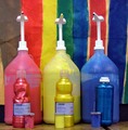
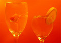
Fruity Fishby battymaddieComment: This is a neat idea, I just think it could be "worked" to be more effective. The composition is a bit flat. The viewer looks from the left to the right to the left, and that is just kinda it. Perhaps if the smaller glass was in front of the bigger one, and off to the side just a touch, it would set up a diagonal line to lead the eyes through the shot. If you needed one glass to be higher, you could sit it on something (catalogs work well) since that is cropped out anyway.
Also, while you have "color on color" there is little to distinguish the subjects from the background. It *almost* looks like you simply "washed" the entire shot with an orange color. A bit more light may help that. I have found that flashlights, or even my husbands worklights can give me a little extra "boost." If they are too harsh, you can cover them with a tissue or papertowel or something to diffuse the light (be careful, they can get hot).
If you already knew all this and this picture looks exactly like you want, my apologies. :) |
| Photographer found comment helpful. |
Home -
Challenges -
Community -
League -
Photos -
Cameras -
Lenses -
Learn -
Help -
Terms of Use -
Privacy -
Top ^
DPChallenge, and website content and design, Copyright © 2001-2026 Challenging Technologies, LLC.
All digital photo copyrights belong to the photographers and may not be used without permission.
Current Server Time: 06/24/2026 08:37:14 AM EDT.