|
|
|
Showing 1331 - 1340 of ~9205 |
| Image |
Comment |
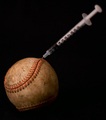
| 05/11/2008 08:15:11 PM | The American Pastimeby arron_christensenComment: CRITIQUE CLUB CRITIQUE
by karmat
Good take on the challenge. It obviously meets the challenge, I think, as it is about a game, but it also tells a story, or has more purpose than just a picture.
Compositionally, it feels a bit tight, cropwise. I think extending the left and right side a bit (more on the left) would give it a bit more room and make it feel a bit more balanced. I do like how the overall composition moves diagonally through the frame -- this gives it some "movement" and it is not as static as it would be if the needle were lying beside the ball.
Technically, the exposure seems pretty good. I think the lighting, overall, could be a bit more dramatic to make it feel not as flat. Also, it seems as if the needle is leaning toward you (or perhaps away) and that makes it fall outside the focus plane. Since the needle is as important as the ball, I think, if it were focused it might be more effective. Another interesting twist would be to shoot it so that the needle were focused and the ball was not.
An excellent take on the challenge, and very nicely done.
Karma |  Photographer found comment helpful. Photographer found comment helpful. |
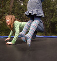
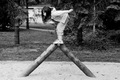
| 05/11/2008 06:23:49 PM | It was a game, until the girls got abducted by aliens...by snafflesComment: CRITIQUE CLUB CRITIQUE
by karmat
Okay, this is funny. I like how the girls are not in the frame -- it adds to that feeling of being pulled up and out of the frame. Actually seeing the trampoline kinda detracts from the "illusion," but without it, there would be no basis for a "game."
Technically, the exposure and lighting is good and the frozen action is really good. There is an odd effect (almost an edginess) visible, though, especially in the denim skirt. It looks like it was perhaps slightly underexposed, so it was brightened, then noise reduction used to reduce the noise. Not sure that was the process, so if not, try it on a picture and maybe you can see what I'm talking about.
Overall, it is a creative effort, but I suspect that some of the lower votes may have been because there is not a recognizable or familiar game in the shot.
Best to you in future challenges.
Karma | | Photographer found comment helpful. |
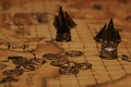
| 05/10/2008 07:41:01 PM | Pirate Battles in the Livingroomby LadyKComment: CRITIQUE CLUB CRITIQUE
by karmat
5.1????? Amazing. I truly would have expected this to score higher than this.
Compositionally, I like how the coins, ship in the foreground and ship in the background form a triangle. This makes the composition strong as well as gives the eyes something to "travel" around.
Technically, I like the lighting on this and the "tone" of the colors. I also think the shallow depth of field is particularly effective. The details are visible throughout (though I had to tilt my screen a bit to make sure).
The only thing I can think of that might make it more appealing is to make the lighting more dramatic. Maybe play with backlighting or sidelighting.
Nice work and best in future challenges.
Karma | | Photographer found comment helpful. |
| 05/10/2008 07:26:14 PM | The playerby Rino63Comment: Critique Club Critique
by karmat
Compositionally, this is a fairly strong picture. It does seem a bit static, though, because it is straight on. Sometimes, a touch of tilt (enough to look like it was done purposefully) can add interest and drama to the story.
Technically, the lighting, exposure, focus and color are superb. It might have added more action to the shot if the shutter was slowed and the person was tossing a card toward the camera. That may not have been your intent, though.
I've read your notes, and it still isn't clear to me why the player is neither male or female (though the red finger nails makes me think female).
Good shot, but your artistic vision/purpose may have been overlooked by the voters.
Nice work and best to you in future challenges.
Karma | | Photographer found comment helpful. |
| 05/10/2008 06:29:25 PM | | | Photographer found comment helpful. |
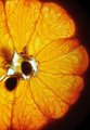
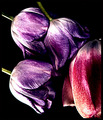
| 05/10/2008 06:01:44 PM | Three Kissesby colorcarnivalComment: I really like whatever it is you've done with the post processing in this. I like how it "mutes' the colors, yet they are still bold. | | Photographer found comment helpful. |
| 05/10/2008 06:00:38 PM | Diveby wei1108Comment: At first glance, I thought that was her legs or stilts or something! | | Photographer found comment helpful. |
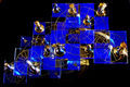
| 05/08/2008 08:03:34 PM | "Queen to King's Level Three"by swordandsigilComment: CRITIQUE CLUB CRITIQUE
by karmat
I really like the blue and gold on this -- it is very striking. I also think that the way that it fills up the frame works well to.
However, I think a different perspective would have made this more dramatic. It is hard to get a good grasp of the 3D nature of this, and since that is one of the things you wanted, you may have been better served shooting from lower and showing the different "levels." As it is, it all kinda muddles together.
You did well in turning the light flares/hotspots into a star shape. That adds some drama to the shot, instead of being distracting.
Nice shot, and an interesting looking game.
karma |
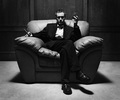
| 05/08/2008 12:28:30 PM | The New King of the City by breadfan35Comment: I love the shadows in this and how they hide his eyes. Kinda like the effect sunglasses have without the pretentiousness of them. Great bw and an excellent example of how a centered composition can work well. | | Photographer found comment helpful. |
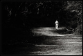
| 05/08/2008 12:27:06 PM | Last Seen ...by SherwinJamesComment: I love the bw conversion here. The size of the man really makes his surroundings look like they are literally swallowing him up. Very lonely feeling. Nice work. | | Photographer found comment helpful. |
|
Showing 1331 - 1340 of ~9205 |
Home -
Challenges -
Community -
League -
Photos -
Cameras -
Lenses -
Learn -
Help -
Terms of Use -
Privacy -
Top ^
DPChallenge, and website content and design, Copyright © 2001-2026 Challenging Technologies, LLC.
All digital photo copyrights belong to the photographers and may not be used without permission.
Current Server Time: 06/23/2026 02:58:19 AM EDT.
|