| Image |
Comment |
| 06/09/2008 10:51:19 AM |
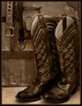
Via con Diosby JuliBocComment: Good composition. I like how the boots are the focus, and the other "pieces" accentuate rather than detract. |
 Photographer found comment helpful. Photographer found comment helpful. |
| 06/09/2008 10:49:58 AM |
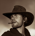
Movin' Onby rjksteschComment: Good lighting. I think a tighter crop on the right would have made it a bit more intriguing, though. |
| Photographer found comment helpful. |
| 06/09/2008 10:49:10 AM |
|
| Photographer found comment helpful. |
| 06/09/2008 10:48:40 AM |
Timelessby snafflesComment: Good composition, but it looks like noise reduction may have removed some details giving it an "odd" look. or maybe it was resizing it. |
| Photographer found comment helpful. |
| 06/09/2008 10:46:40 AM |
|
| Photographer found comment helpful. |
| 06/09/2008 10:46:18 AM |
|
| Photographer found comment helpful. |
| 06/09/2008 10:43:34 AM |
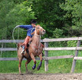
Howdyby MAKComment: Great lighting and pose. |
| Photographer found comment helpful. |
| 06/09/2008 10:41:54 AM |
|
| Photographer found comment helpful. |
| 06/08/2008 10:19:33 PM |
Lined up for a Stormby RulerZigzagComment: CRITIQUE CLUB CRITIQUE
by karmat
Compositionally, this is a strong shot. I like how the water in the foreground, the boats and the sky form three distinct sets of "strata" that divides the picture. Also, there is a very faint vanishing point used from left to right.
Technically, the whites look a bit "over bright;" not blown out, but definitely drawing the attention of the viewer. In one respect, this is good because the challenge was boats. On the other hand, it really downplays the storm blowing in, and while it can be seen, it doesn't look to dark or ominous, like one associates with a storm. More contrast, or something like shadows/highlights might have given it a bit more "pop."
Overall, a nice shot that definitely meets the challenge.
Karma |
| 06/08/2008 09:55:12 PM |
ITZLI - Aztec God of stone.by Ecce_SignumComment: I like the composition and the use of negative space, but it seems really flat to me. Also, because there is little or no definition between the arm and shoulder and the face, it looks he has no chest and a really short arm. |
| Photographer found comment helpful. |
Home -
Challenges -
Community -
League -
Photos -
Cameras -
Lenses -
Learn -
Help -
Terms of Use -
Privacy -
Top ^
DPChallenge, and website content and design, Copyright © 2001-2026 Challenging Technologies, LLC.
All digital photo copyrights belong to the photographers and may not be used without permission.
Current Server Time: 06/22/2026 05:49:51 AM EDT.