|
|
|
Showing 1131 - 1140 of ~9205 |
| Image |
Comment |
| 06/16/2008 12:11:23 AM | |  Photographer found comment helpful. Photographer found comment helpful. |
| 06/15/2008 11:42:38 PM | Masqueby Love6Comment: CRITIQUE CLUB CRITIQUE
by karmat
I like the general crop of this, though I think showing exactly half the face is a bit unbalanced. It may have felt more balanced and even if you had included just a touch more of the face. The negative space works well here, I think.
Technically, the bw is good, and it looks as if the exposure is pretty near right on. However, the focus is a touch off it would appear.
Also, I'm not sure what purpose the black thing serves. I almost think it would be better without it, but I am assuming you have a purpose for it.
Overall, a good shot and a good idea. Best to you in future challenges.
Karma
| | Photographer found comment helpful. |
| 06/14/2008 11:21:34 AM | Something Old...by zackdezonComment: CRITIQUE CLUB CRITIQUE
by karmat
First off, I love the tight composition of this. While the tower thingy in the background is a bit distracting, in one sense (and it would make a really cool picture without at), in another sense, it adds to the shot by contrasting old/traditional with more modern.
Technically, the focus, exposure, etc. is good. I think the biggest thing noticeable to me is that it seems to be gray overall. It needs some more distinct white/light areas, I think. Admittedly, I am not sure how or where, unless in the conversion process you could get the whitish area on the right a bit brighter.
Overall, a nice shot. It is very graphic and clean.
Best to you in future challenges.
Karama | | Photographer found comment helpful. |
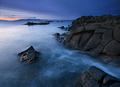
| 06/12/2008 10:58:14 PM | Black Rock Coastby orvaratliComment: CRITIQUE CLUB CRITIQUE
by karmat
Wow, 7th out of almost 500. There is not a lot I can say to improve on this, so I will simply tell you what I think you did right, and what grabs people's attention.
First off, the colors are wonderful. The are cool and soothing, and the level of contrast and saturation is very near perfect. If it had been possible to boost the reddish hues in the background, that *might* have added something, but I'm not sure.
Also, the exposure is wonderful. The details in the rocks are still visible, but the nature of the water has a nice ethereal feeling to it. Likewise, the lighting (brightness and contrast) works very well.
This is a lovely landscape, and something I am sure you are very proud of.
Congrats!
Karma | | Photographer found comment helpful. |
| 06/12/2008 12:51:52 AM | |
| 06/12/2008 12:51:40 AM | | | Photographer found comment helpful. |
| 06/12/2008 12:51:25 AM | | | Photographer found comment helpful. |
| 06/12/2008 12:51:13 AM | |
| 06/12/2008 12:51:00 AM | Too wet to playby libertyComment: There is little "right" about this shot, but I really, really, really like it. | | Photographer found comment helpful. |
| 06/12/2008 12:43:19 AM | stairs and bricksby nabuslComment: Great textures. has a very desolate, lonely feeling -- like a kid wondering when his mom will get home |
|
Showing 1131 - 1140 of ~9205 |
Home -
Challenges -
Community -
League -
Photos -
Cameras -
Lenses -
Learn -
Help -
Terms of Use -
Privacy -
Top ^
DPChallenge, and website content and design, Copyright © 2001-2026 Challenging Technologies, LLC.
All digital photo copyrights belong to the photographers and may not be used without permission.
Current Server Time: 06/21/2026 10:06:12 PM EDT.
|