| Image |
Comment |
| 11/16/2007 06:29:45 AM |
Nakedby eyjoComment: Needs more of an interesting focal point. |
 Photographer found comment helpful. Photographer found comment helpful. |
| 11/16/2007 06:29:16 AM |
|
| Photographer found comment helpful. |
| 11/16/2007 06:28:49 AM |
Naughty Barbieby Martyk22Comment: Interested, but whole thing is a bit too dark and gloomy. Perhaps neon light for the 'wrong side of town' effect? |
| Photographer found comment helpful. |
| 11/16/2007 06:28:06 AM |
|
| Photographer found comment helpful. |
| 11/16/2007 06:27:32 AM |
|
| Photographer found comment helpful. |
| 11/16/2007 06:27:17 AM |
|
| Photographer found comment helpful. |
| 11/16/2007 06:26:47 AM |
To Much Windby vtruanComment: Photo is ok, but seems a little out of focus? Longer DOF would have worked for me here too. |
| Photographer found comment helpful. |
| 11/16/2007 06:25:43 AM |
Passionby compugeek722Comment: Naked lightbulbs - really difficult to capture! As a result it has blown out the complete top quarter of your picture, which is a shame as it was very inventive. |
| Photographer found comment helpful. |
| 11/16/2007 06:24:38 AM |
|
| 11/15/2007 03:31:28 AM |
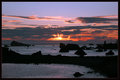
Preludeby HoserComment: I have to agree with the other comments. By centering the horizon, you have divided the photo equally so the eye does not know which way to go. Additionally the black foreground cuts the bottom portion in half, which acts as something of a barrier (perhaps would not be the case if it was not completely in shadow?). I would crop out the bottom section to leave the horizon 1/3 up the photo, with a small black foreground at the bottom. Perhaps it could be crisper? Difficult photo to take though. |
| Photographer found comment helpful. |
Home -
Challenges -
Community -
League -
Photos -
Cameras -
Lenses -
Learn -
Help -
Terms of Use -
Privacy -
Top ^
DPChallenge, and website content and design, Copyright © 2001-2026 Challenging Technologies, LLC.
All digital photo copyrights belong to the photographers and may not be used without permission.
Current Server Time: 05/25/2026 10:20:09 AM EDT.